About “About ‘About Digital Comics'”
It took about 3 minutes in the mid-’90s for comic strips to take to the Web; like those newborn babies dropped in water that instantly know how to swim. If an online comic strip looked like its printed cousins, it was just as readable. If surfers had short attention spans, no problem. The Web was one big refrigerator, covered with magnets, waiting for something short, funny and recognizable to snap on to its audience.
Long form comics (the online equivalent of comic books and graphic novels) have had a harder road to follow. Fewer readers have the time or stamina for a web-based Maus or Watchmen during precious coffee breaks at work. And long, serious comics don’t always lend themselves to the kinds of conspicuous ads and light-hearted merchandise that have kept many daily strips afloat. Still, if a young artist is passionate enough to create a long form masterpiece they won’t let these limitations stop them and sooner or later they’ll find an audience.
But there’s one more obstacle, which is far more infuriating because it’s so pointless and unnecessary: The page designs of most long form webcomics suck donkey dick. Good artists and writers—including some of my favorite cartoonists in the world—force readers to sroll, then click, then read, then scroll, then read, then click, then scroll again for no other reason than a stubborn belief that all comics pages have to be taller than wide, and that all web pages need a metric ton of blinking crap at the top to work.
Long form comics are different from strips. If a cartoonist wants their readers to stick with a 60-page story about their Moroccan grandmother’s struggle with Diabetes, they need that reader to lose themselves in the story. That means keeping readers’ eyes on the page. Every time a reader looks away to navigate, they’re leaving the world of the story, and returning to the world of scrollbars and links.
The simplest solution—choosing screen-fitting pages and putting them near the top of the screen—is not rocket science. Charlie Parker’s Argon Zark did it over a decade ago (screens were smaller then), Justine Shaw, the first webcomics artist ever nominated for an Eisner, created a near-perfect format with Nowhere Girl in 2002 (making the entire page a next button), and Larson and O’Malley’s wonderful Bear Creek Apartments from 2008 had no trouble getting thousands of readers to click to the end.
But still the madness continues, and every day another dozen artists put their comics online using a format every bit as a annoying as a TV show that automatically changes channels every 3 minutes, while a four year-old stands directly in front of the screen, screaming the theme from Barney.
Which brings us to Yves Bigerel.
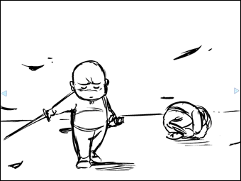
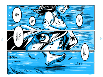
A lot of people have been pointing me to Yves’ two webcomics about webcomics over the last couple of weeks. If your own attention spans aren’t too taxed already, I hope you’ll consider reading both now from beginning to end (should only take about 6 minutes, they’re not too long):
Now, there are about a dozen issues raised in these comics that I’m not going to touch on. He’s actually heading in some directions that I’d be reluctant to go. But there’s no question that these comics struck a chord with artists and readers in the last few weeks, including me. And I think that one of the most refreshing aspects (“refreshing” as in a cool drink of water after five days in the desert) is the fact that navigating using Yves’ system is as simple and intuitive as breathing.
If that’s the message more cartoonists take to heart in the coming months, we may see some progress yet.


Quick postscript:
Yves Bigerel credits the long-running Platinum Grit with inspiring his approach. Check it out (NSFW) at:
http://www.platinumgrit.com
Hey, Scott! Good to see you back in the field; hoping the Internet hate machine doesn’t scare you away too quickly.
I consider my work more “long-form” than “short-form,” though most of it does share some “short-form” characteristics (periodical installments, with a “cymbal crash” of humor or drama at the end of each). Though I’ve experimented, and hope to experiment more, I find myself using the sucky page-inspired interfaces you describe, more often than not. I have a few theories about why.
For me, scrolling sends a Marshall McLuhan-style “message.” It “says” that the creator views the current installment like a page in a book, and encourages me, as a reader, to read it as such, instead of as a “done-in-one” installment. Translated to English, the message might read, “We’re not going to give it up for you all at once. You have to work at it.”
There are other, economic considerations. We may not be as ad-friendly as some strips, but we do generate a significant percentage of our income through ads, and the page size allows us to accommodate more ads in a variety of sizes, maximizing that revenue. A truly “screen-sized” strip, like those in the full-screen reader at Zuda, would leave no room for ads at all!
It would be possible to develop an ad-friendly, no-scrolling page, but then the strip itself gets squeezed down, to newspapery proportions or something close. And as you know, that’s not a great format for storytelling. Some strips do manage to tell long stories effectively with it, but to do so, they often have to disguise themselves as gag strips, even more than we do.
Like many online strips, we publish in print as well. My early work in FANS will never be printed, mostly because its format was simply too experimental for any print treatment not formatted like THE ACME NOVELTY LIBRARY. I’m not eager to repeat that circumstance, though I might switch formats when I end Book Six and begin Book Seven of the series, late this year or early next.
Beyond that, I’ve never found scrolling-and-clicking to be all *that* difficult, and a good thing, too, since I wouldn’t be able to navigate your blog without it (or my Facebook page, or Google search results…) I mean, yes, the Zuda-like reading experience is easier. But in the past, I’ve mistaken minor conveniences like that for STEPS THAT MUST BE TAKEN IF COMICS ARE TO EVOLVE (which made me nearly unbearable when I was promoting things like OhNoRobot), and I no longer think there’s that kind of urgency.
Finally, there’s the fact that some comics don’t have complete control over that sort of thing anyway, like SHOOTING WAR and A.D., which have to exist within SMITH’s format.
In the end, I agree that a horizontal configuration is a good one for story comics to explore further. Certainly Meredith Gran is kicking ass with OCTOPUS PIE, and her print collections (in an Andrews and McMeely format) seem to work just fine. I’m just pointing to some of the reasons, apart from hidebound conservatism and a lack of imagination, that story comics haven’t plunged into the format already.
Oops, long break there. Back to work.
Hi T —
Thanks for enumerating the reasons people settle on the format. There are plenty of understandable reasons, of course. I’m pretty much just critiquing the result as a reader. I don’t have an easy solution to the practical concerns — I wish I did. Bear Creek Apartments is a great comic, but I don’t see that it brought its creators any profit. Good design = bad business? Maybe.
Note that it’s not scrolling per se that I object to, but the constant *changing* of mode while reading. Scroll-scroll-scroll would be every bit as transparent as click-click-click (and Heaven knows I’ve forced readers to scroll as much as anyone in my early experiments) but scroll-click-hunt-scroll-click is just bad all round.
Hey Mr McCloud, I’m glad to see you posting about the “digital comics” thingies i’ve made, actually i’ve translated it in english in the first place for you to read (i’ve sent you an email right after it but it seems you didn’t got it).
I’d be happy to read more criticism from you about it, if you’ve got the time, especially what directions you are relectutant to go specifically.
Anyway, i’m very happy it somehow get to you and you’ve find some interesting points in it!
Hi Yves! Great to hear from you. Congratulations on the warm reception the comics have been getting.
Wasn’t able to find your email on a search through my inbox, but I’m about 500 emails behind so it might be there somewhere. (I’m, uh… a little behind). Sorry if it was my oversight.
I think it’s important to follow your instincts on this. My personal hang-ups have more to do with esoteric notions of comics’ identity, the importance of juxtaposition, etc… There are applications of the method that steer closer to animations and slide shows and others that are a bit closer to comics’ core assets and I’d probably favor the latter.
But I don’t think you should worry about that sort of thing. If you have a story to tell, I’d just use whatever tools you think get the job done. The more you care about a story, the more you’ll find a clear path toward telling it in a transparent way. Would love to see you apply that more dramatic style from the second episode in service of a short self contained story. Maybe even something from your everyday life.
Whatever you do, don’t worry about theory wonks like me! You’ve made a great statement about storytelling. All you need now is a great story. 🙂
I think what remains the block from experimenting more with the web medium is the hope that everythig your doing for the web will be discovered by a nice editor that will ask you to publish everyhting on paper. And if you went to far with your storytelling experiment well your kinda of have to redo everything… or most of it.
As a reader, I’ve found that I have no problem whatsoever with scrolling. Standard website design has taught me that nothing useful is ever in the top 1/3 of the page, so I scroll down automatically. I definitely think there’s room for internet comics to move away from existing conventions, but I think that comics will organically evolve over time. It won’t happen quickly, but eventually internet comics will not imitate print comics as they do so often now.
I find the “About Digital Comics” installments fascinating and would love to see more. They do have some animation/slideshow type sensibilities about them, but in this era of innovation I think the purity of a medium is less important than using whatever techniques you can to tell a good story with interesting points.
“…in this era of innovation I think the purity of a medium is less important than using whatever techniques you can to tell a good story with interesting points.”
Well said. As much as I focused on “identity” issues in the early days, I definitely think that right now we just need good stories and good storytelling.
Hey Scott,
Speaking of straying from comics identity, I was reading “About Digital comics” and I got to thinking. If you use the format that Yves used but without individual panels within each image, but the the story still relied on the relationship between and progression of images would it still be a comic?
Surly it wouldn’t be film.
(A similar instance to think about: a comic book with only one panel per two-page spread, e.g. many woodcut novels.)
I’ve been thinking about the same thing, Jacob. To me the most important difference between film and comics is that the film audience doesn’t easily control the rate at which or order in which they view the film. (Pausing or rewinding is a disruption of a film, but not of a comic, in my view: the ability to effortlessly perform these actions is what makes comics “read”, like books). Whether successive panels are actually juxtaposed seems a less important difference (despite Scott’s definition in Understanding Comics and concerns above, sorry!).
On the other hand, juxtaposition can contribute to that effortless flexibility of pace and order that the audience/reader experiences, allowing the reader’s attention to easily rove over different moments in the story or even take in multiple moments (almost?) simultaneously.
I imagine we’ll be seeing a lot more intermediate, indeterminate forms on the web in the future.
This is a very interesting theoretical concern. I’m also curious to know what Scott thinks.
Yeah the whole one panel at at a time thing has been a big loophole in my definition for a while — especially on the Web.
But as Robynne and others have pointed out, if it works, it works (even here in wonk-central).
Hello Mr. McCloud! I’m a high school senior hoping to go to college for Sequential Art, and your books have been a major inspiration for me.
It seems to me like this may be the next big thing in online comics. A lot of big sites, such as Tokyopop and Zuda Comics, are starting to use standalone comic ‘players’ fitted to a monitor. It’ll be interesting to see how this turns out. Something that I was wondering, was what would happen if someone made a standalone device made specifically for this style of webcomics? I understand that Flash has these capabilities, but it’s also fairly expensive. A simple standalone tool might allow more people to experiment with this style, providing a better flow of ideas and a much quicker evolution.
[…] sur les deux webcomics de Balak à propos de la bande dessinée numérique et a pondu une note About “About ‘About digital comics’” : If a cartoonist wants their readers to stick with a 60-page story about their Moroccan […]
The Tokyopop player seems to be flash based as well. But it’s nowhere near as simple and clean as Yves’ design. One way of keeping the “full page” format would be to make that up and down arrows on the keyboard scroll up and down the page. I think that would be the best way to present web comics that could later be published.
Another thing to keep in mind is the complexity of the artwork. Yves’ drawings are very clear (not simple or bad, the twilight-ripoff panels are very well rendered while maintaining clarity) and work excellently with the amount of space the player allows. But the pages I’ve seen on Tokyopop’s player were clearly meant to be published on actual paper. Even in full screen on my 20″ monitor it was somewhat hard to follow. I think comics with a more sparse layout (like Blankets or Scott Pilgrim) which don’t need to cram as many panels into a single page would work best.
I kinda like keeping several panels on one page though. I like the idea of being able to view several “moments” at once. But now that I think about it, one panel at a time keeps the reader in that one moment, still giving them the ability to go back and forth. It also reduces the chances of the reader skimming over an important part of the comic. And there’s still the possibility of having a few panels in one frame. I think I might have to experiment with this.
[…] [Commentary] About “About ‘About Digital Comics’” Link: Scott McCloud […]
[…] you, Scott McCloud, for saying what needed to be said: The page designs of most long form webcomics suck donkey dick. Good artists and writers—including […]
Scrolling and clicking is pretty unavoidable especially if you work in the infinite canvas medium. The important thing, in my opinion, is to give readers the option to move around WITHOUT needing to scroll. The navigation buttons should be included at the top of the page and at the bottom. New readers can look through the comic, scroll naturally as they read it, then hit next. Returning readers simply have to press next.
No fuss, no muss. The comic should be the first thing that appears as well. If you have to scroll to read the comic, your site is designed poorly.
The thing I really like about this kind of approach – even if you were to step it up a notch and have some movement in more than one direction – is that the atomic/granular steps lessen the sense of the author losing control over the story, and it fizzling out into a sort of nothing.
Things like the Tarquin engine – while freer and infiniter – make it a little too easier to get lost in the gutters between panels
Ok, so in this the creator controls reading pace, but I think he also crafted something that should be looked at. Especially with how he paired panel interaction with the music. Check it out.
http://www.youtube.com/watch?v=rT8EG3ATRvg
That video is by Mark Crilley. Cool!
Thanks, Scott! I’m honored you checked it out!
mark
[…] reference to our earlier thread on formats, I think for those who choose a screen-fitting page-to-page approach, the format SMASH […]