


I Will Beat this Horse Again and Again until it RISES FROM THE DEAD
What’s the default shape of our art forms?
Cinema is wider than it is tall. TV is wider than it is tall. Theater is wider than it is tall. Laptop and desktop monitors are wider than they are tall. In fact, with the advent of widescreen TVs, there’s little difference in the shapes. They’re all around 3×5 or 4×5 range. Wider than tall. All of them.
And print? Well, print is taller than it is wide right? The printed page is the exception to the rule, isn’t it?
Wrong.
The default shape of print is not taller than wide. It’s wider than tall just like all the rest, because the default shape of print is two pages side-by-side. And the reason is the same reason as the shape of TV and cinema and theater and surfing and all the rest: because we have two eyes next to each other, not one on top of the other.
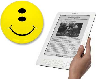
I don’t even have a Kindle yet, so this isn’t meant as a specific critique of the device. And I’m sure its engineers had solid practical reasons to design the device the way they did. You can even turn it sideways when needed. It just reminded me when I went to Amazon this morning and saw images of the latest, how design principles in the wild can always be adjusted on the fly, but as soon as they’re embedded in hardware, they tend to stick around. For decades in some cases.
So if I could humbly suggest a new cardinal rule of designing anything meant to be read (including webcomics): Step #1, look in a mirror.
[Edit to add: Within ten minutes of posting, everybody has agreed that I’m utterly wrong about this! Oh well. Check the comments thread to see some smart, funny rebuttals.]
I ama totally bored with that rules of design, shape requirements etc. as a visual arts and visual communication senior student, I did a stop motion animation when I was a 2nd grader which was meant to be a portrait, when exhibited, not a landscape but unfortunately it was not possible, but I insisted and did it a portrait. it looked pretty wrong, a portrait in a landscape. but it’s a reaction. we shouldn’t be stuck in those frames. I love the comics panels for that instance. can be used any form, even without borders. we don’t need more borders in this life.
When it’s hardware, someone always chooses borders. The fact that we can turn 90° is a liberating development, but I still think there’s an inherent assumption (that I see in long form webcomics all the time) that the comics page MUST be that shape.
As for “no more borders,” that’s what this stuff is all about. This above rant is only regarding instances where people choose the page metaphor to begin with.
btw, I don’t think what you stated is wrong, they are facts. but, what I said was more about what I wish it was, they were.. for exp: I would love to have Kindle, it would be easier for me to read, when it’s a portrait (though I am a die-hard-fan of printed material-other than hypercomics and blogs) but, i prefer to use a wide-wacom, it gives my hand an ease when drawing. it’s relevant with my screen as well but what I mean to say is that. when being passive to some sort of visual material, I, personally prefer portrait (I can not explain why) but when active, I usually prefer wider planes.(my first example in the first comment was exceptional)
But my mirror is taller than it is wide!
Touché, Sir.
“The default shape of print is not taller than wide. It’s wider than tall just like all the rest, because the default shape of print is two pages side-by-side.”
Yes, but do you read or even recognize both pages at once? No. I argue that second page doesn’t exist until you complete the first, no matter it’s physical presence.
And, okay, look in a mirror. What area do you recognize in preference for everything else. Your face. What proportion is your face? Faces are what we first learn to read.
It’s not the matter now info is presented, it’s how we scan and process it. We don’t actually take in all that we see.
Heck, Scott, look at your own blog. How wide is the live, read, area of text. Be honest, the side bars are marginalia that are second reads at best if read at all.
And from a physical practicality, how comfortable would be a wide Kindle be to hold? How do you hold a book?
You loving devil’s advocate–Jenn
I understand why text width has its limits. And yes, that’s why I keep a narrow column on the blog, but at any given time the active area viewed in the screen of the whole main page is landscape (unless the reader has a very big display).
With comics pages filled with panels, though, I just don’t see the rationale at all for width limits.
Okay Scott. You are on crusade here. I respect that.
However.
You are ranting against the particular design of a particular device that is asking folks to consider a replacement to the traditional book. Which is by and large a particular shape. And, by the majority, experienced a page at a time.
And whereas I see why you might want to change the pre-concepts of humanity, you can’t ignore them.
My default browser set-up, at home with my handmedown Sony monitor, is taller than it is wide. I read a lot of text online; it’s what works for me.
I’m remembering those old monitors they had for newspaper layout and such that you could physically rotate to portrait or landscape as you needed.
I haven’t seen the monitors you’re talking about specifically, but the first time I saw a commercial for the iPhone, I was struck by the notion that I was looking at the future of display technology. I’m glad to hear the Kindle now has auto-rotate, but the real next step, now that we’ve moved past tube screens to flat screens, is for the standard computer monitor to be rotatable. It would obviate the entire dilemma of moving between print and screen–you could design however you wanted, and the hardware would adjust to the art, rather than the other way around.
It,s not just the old costly CRT monitors. There are now sevral LCD monitor manufacturers which offer several sizes of monitors with the capacity to physically rotate the screen. If the monitor and the PC and the software are from the same manufacturer then the OS will automatically recognize that you’ve rotated that monitor manually and rescale and resize everything in your desktop. HP has two monitors like this, and also at least one Korean company and one Japanese company.
no matter how the page layout is, whether it’s wide or tall. our eyes focus on the left-middle first, so, face is irrelevant because otherwise, if we take mirror as a page layout, and if face is the first thing we notice, we would focus on our left cheek (real time right cheek) instead of our eyes. so, face is not an example, nor the mirror. they are exceptions.
“Yes, but do you read or even recognize both pages at once? No. I argue that second page doesn’t exist until you complete the first, no matter it’s physical presence.”
Watchmen, Chapter 5: Fearful Symmetry. Look at the pages where Ozymandias gets attacked.
Also see The Dark Knight Returns. Every splash page is on the left, because Frank Miller knows that splash panels have more impact if they are the first thing you read immediately upon turning a page and not hanging out on the right side, already seen before you’ve read to that point in the story.
For straight-up text, as in novels, usually one page is perceived at a time… even one sentence at a time, because the visual appearance usually isn’t given much consideration. But for printed comics, for magazines, and for books that take layout into consideration (obvious examples being Mark Z. Danielewski’s “House of Leaves,” “Only Revolutions,” and “The Fifty-Year Sword” in the last case using a blank page on the right side of each spread to create discomfort), the side-by-side pages are often perceived together, and to transfer them to single-visible-page digital versions is to rob them of some of their intent and power.
Probably this has been covered farther down the comments thread, but I wanted to interject while I was thinking about it.
Cheers!
I think the main reason is that we can’t read large lines of text. We would get confused every time we changed from line to line. That’s why Kindle was designed on vertical, and that’s why besides our monitors are widescreen, the text we read are usually in short rows, as in your blog…
Agreed there, though see my comment to Jenn above regarding the blog. I don’t see it for comics pages.
“I argue that second page doesn’t exist until you complete the first, no matter it’s physical presence.”
Well, if you’re going to say that you might as well say the format for any print story should be one word per page since the only word that exists is the word your eyes are currently focusing on.
I’m not saying you can’t make a devil’s argument against “wider- than-tall” rule, but they’re not very good arguments.
“faces are what we first learn to read”? Irrelevant.
And for that matter I could argue the most distinguishing feature of the face are the eyes. Which, side by side, are a wider image than they are tall.
But all this doesn’t matter. Here’s the bottom line.
Our field of vision is wider than it is tall!
I’m not saying there aren’t exceptions for good designs that break this rule (a portrait of a face) but there’s a reason for the rule.
We like things put out landscape. Even the crap on our desk. We can reach side to side, because are arms come out from either side of our body. There’s a logic behind it.
Ironically, I just posted my postscript saying everybody thinks I’m wrong about this as Matthew posted his comment kind of agreeing… Oh, the irony…
Scott, I wonder if the amount of criticism you’ve received regarding Reinventing Comics, etc., has made you too hasty to back down and say that everyone disagrees with you.
That may not be the case, of course – as you are certainly continuing to discuss and expound on your ideas. I just wonder if it helps to undercut yourself at the outset by saying that “everyone disagrees with you?” And in what ways that might be limiting you?
In the interview you did for “The Sound of Young America” podcast, there was a part where I got the feeling you were really beaten up about some of the Reinventing Comics ideas, and that you were reluctant to assume the “radical, revolutionary” position. It’s a tough spot to be in, for sure, but I’d be really upset if a bunch of naysayers convinced you to stifle yourself in any way. Again, maybe you aren’t. But I’ve gotten this impression several times from you, and I don’t think you need it.
Two metacents, from a fellow new-idea enthusiast.
Matthew,
No, we do not look first at the eyes. We take in the face as a whole. See the chapter on facial expressions in “Making Comics” for why.
Scott, I know at least one of the web comics I follow maintains the portrait format for the simple reason that the pages are later collected and published. Reformatting, or requiring a custom printing format, both add significantly to cost (either labor at the artists end to re-format or in cost to publish).
And comic strips, at least, are in ‘landscape’ mode. So we have a mix.
I didn’t say we look at the eyes first. I said you could argue they are the most distinguishing characteristic. And again. It’s irrelevant.
pardon my typos: “are” should be “our.” Can we get a delete function for our own posts? 🙂
Apparently, this Kindle auto-rotates the screen, specifically to accommodate wide views or side-by-side pages. See: http://www.engadget.com/2009/05/06/live-from-amazons-kindle-event-in-nyc/
Cool!
Again, I should stress that the device put the thought into my head but wasn’t really a direct target of the rant. Obviously some serious thought went into the design.
Bottom line is just that I wonder in what subtle ways it’ll reinforce that “shape of print” assumption out there and lead to less enlightened designs in the future.
I can dig it! And I agree with your point. There’s no reason a completely digital device has to imitate the limited format of a printed book, but here we are.
(As a side note, personally I’m a two-columner…whenever I’m taking notes or making lists on a tall/skinny page, I tend to divide it into two and work horizontally — if that makes sense.)
Except that a common rule in book design is that a line of text should never exceed 85 characters (or fall below 65) because any longer, and the eye has difficulty jumping to the next line, either skipping lines or going back and rereading the line it just read. Apparently our eyes can only travel so far before they get lost on a page of solid text.
As for how this applies to comics and other media: I’ve tried drawing comics in a horizontal format and found that the natural shape of the human body (which is vertical, not horizontal) doesn’t fit very naturally into that space and that it’s more difficult to lay out panels on the page because they feel squished into a smaller space because of so little overhead. When I DO manage to get them laid out well, they nearly always end up in a format where there’s a series of panels on the left of the page and then a larger, open panel on the right (or vise versa), essentially creating two vertical pages contained on a single horizontal page. Like a spread.
There are times I actually wish my monitor were vertical rather than horizontal. All the wasted space to the left and right of the monitor will never cease to annoy me, and having had an LCD monitor once that actually rotated and could stand vertical … I even more intensely dislike the format.
Movies being horizontal make sense because if you have a theatre, you can fit more people into a theatre that is wider than it is tall, can’t you? And televisions because a horizontal television with a wide base is more stable than a vertical television with a narrow base, plus it mimics the format of movie media.
The reason comics (IMHO) are better expressed vertical is because it offers a more dynamic page: You can have a nice tall page by only using the entire page, or you can create a series of horizontal panels by breaking it up. But by using a horizontal page, you severely limit the amount of height and create an excessive amount of length if you try to break it up into panels, especially panels stacked on top of each other. Seems like it would create an awful lot of white space to me.
Which could certainly make for some interesting effects, but doesn’t seem like a standard format to me.
Depends on how you look at things, though. You got me wondering about the actual relevant information being presented, and what the unit of that information is (think of units like kilograms, metres, a discrete standardised measurable quantity).
A comic book’s unit of information that you focus on is the panel, not the page typically, though there are obvious exceptions (like the “Fearful Symmetry” chapter of Watchmen). There’s probably a great argument for comics as actually having no discrete unit of information, now I think about it, because writers tend to do everything from small panels to splash pages covering two pages at once, but bear with me.
A television screen is presenting one unified image. You’re looking at the whole damn thing at once, with details generally concentrated towards the centre. The unit of information is the whole screen that you focus on.
What’s the unit of information on a book? If it’s the paragraph, or the sentence, then typically the thing is wider than it is long. I *imagine* it’s the sentence, though I have nothing more than a vague feeling to support that.
actually I believe that, if a word would be longer (if you were to harm the typeface) (which should never be done btw) than being wider, it would be the first thing we notice. our eyes and our brain get used to seeing wider shapes, we are familiar. if we see something rule breaking, out of the ordinary, it would surely be the point of interest.
Scott,
I recognize your argument that some media is generally wider than tall. But for reading heavy amounts of text, readability is vital. (Let’s skip over legibility for the time being.) Readability is what defines page width.
There are some basic guidelines (and studies that bear them out) that comprehension peaks at around 40-70 characters per line. Opinions vary somewhat but a line width of between 21-27 picas (old school!) in length using a font sized between 10pt and 12pt with at least 2 pts of leading are optimal.
Now, of course not everything needs to fall into these dimensions to be readable: your column width can be smaller, (as in a newspaper) and your typeface can be bigger or smaller, but these are rough guidelines that help us all.
I know that when I pick up a book or read some long form reading material that doesn’t use these conventions I struggle a bit and wish more people were aware that the way content is displayed can be just as important as the content itself.
And yes, I’m a professional graphic designer.
Naturally, the real breaker for text-readers is line width. I don’t disagree there.
My own sack of potatoes is, of course, webcomics. Meredith Gran had pointed out on Twitter that her Octopus Pie, which is nicely suited to our field of vision, didn’t work on previous versions of the Kindle because they lacked the auto-rotate, so there was a concrete example of the hardware actually mandating a format which I’d contend is not as natural for our field of vision.
(Of course, now the Kindle is improving in that regard, and my illustration seems to be punishing them for it. Sorry about that, Kindle Guys!)
“So if I could humbly suggest a new cardinal rule of designing anything meant to be read (including webcomics): Step #1, look in a mirror.” Our faces are taller than wide!
At first when I read this I thought you’d fallen off your rocker, but I’m beginning to see that you’re right.
I absolutely agree with Carla. Comprehension drops when a line of text exceeds a certain length… but, why does the page need to be any wider?
Hold a single page of a book in front of you — the eye cannot focus on the whole page at once! On a digital device such as this there’s simply no need to adhere to the limitations of the printed age.
The solution? Halve the height of the device keeping the width the same!
The default shape should be a square, like this avatars there. That’s the future. And eventually when evolution catches up with the fact that depth perception is overrated, our eyes will merge into one.
I’m a genius, I know.
Id say that in print, it depends on the medium. For instance in newpapers the shape might be one long vertical column along the side of a page, or it might be 4 columns making a long horizontal shape.
Id say the text is really what you can focus on at any given point. Id bet that for most people its a paragraph. That why we invented them, because we cant keep track on a long page without some break in the action.
I think the reason that visual formats are wider than taller is because our vision by default is the same. And when u try to show lots of people you normally dont look up, you look side to side. PS. Scott your TED talk was awesome.
The reason the web is vertical is because of ergonomics and hardware. Ergonomically, we’re used to the scroll wheel on a mouse. Our fingers naturally pull vertically toward the wrist, rather than horizontally across the other fingers. And hardware-wise, most websites are still based on a 1024×768 resolution standard, which lends itself to narrow vertical strips in anything wider than 1024 pixels. For example, I have a 22″ monitor at 1680×1050. I have to scale down my browser windows not because the web is vertical by nature, but because it was ten years ago and designers haven’t adapted to the widescreen-formatted monitors that are just now becoming popular.
In addition, text and graphical layout are different. I agree with the “large block of text” argument, but at the same time, trying to read any currently-in-print graphic novel on a Kindle would prove difficult. Two-page spreads are a lot different from reading War and Peace. And even reading books, you can’t continuously keep going down the page, you need a break or border somewhere.
Finally, readers of English read left-to-right first, and THEN top-to-bottom. For example, I think we’re less aware of left-to-right movement in an image because it is natural, whereas vertical movement (such as lines moving toward a horizon) draw us in because they are unnatural. Human beings work on a decidedly horizontal plane, and the vertical is therefore unnatural to us. Which is why the Kindle seems like a good idea, but from a design standpoint (in which the goal is clear communication, not necessarily ‘looking cool’) it’s hard to reconcile with the way our bodies are built and our brain processes visual information.
My two cents. Might be wrong, but that’s what I think.
On your side. “the default shape of print is two pages side-by-side” speakin’ as a rapacious reader of books, yes yes yes.
For what it’s worth, I think it would be worthwhile to see a Kindle or other such device designed the way you suggest. And the latest webcomic I’m doing (Tamino, you know, that one that “looks like it’s designed by Russian steel workers”) is much wider than it is tall. The other opportunity in designing a Kindle to be wider than tall is that it could eventually be a media device where one could watch movies and shows on it. How cool would that be? Look at the screen on an iPod. No, I think you’re right.
My posit is: Scott’s Default Shape should be the developmentally “older” landscape format (as Eisner points out) and that “threat assessment” and standing up lead to Portrait orientation.
I would love to see a landscape e-book reader with two side-by-side pages. Drag a finger across a touchscreen from right to left to turn the page just like a book, half the page refreshing. (and we could have page numbers? I understand why page numbers is not an option on Kindle e-text, but I still miss them) I think faux book features help ease the transition to e-text.
Actually, isn’t our vision sort of round and fuzzy at the edges?
More then that, we actually only “see” the center five percent of our vision well-everything outside that is blurry and impossible to read. Try reading a comment without moving your eye; it’s impossible.
I agree…
but I draw in portrait format on my laptop. I spread it open, like a book, so the keyboard is under my left hand where it should be, and the wacom screen under my right.
I totally agree. I extra agree. Of course I was with you on micro-payments too. 🙂
Before there were books with pages, there were scrolls, yet even in that format, the content of those scrolls was arranged in columns. The columnar format is dictated by the fact that we have two eyes! What’s the other striking characteristic of the media you have described as “landscape”? Those media are like an actual landscape: we view them from at least a few feet away (even your monitor should be further away than you would typically hold a book, otherwise you might be wrecking your eyes). But between our two eyes we have an obstructing nose. If you have to look at something that is close to you (like a book held in the hand) if it is too wide, you have to turn your whole head in order to see the far edges of it with both eyes or you have to hold it further away. Try staring straight ahead at something close to you and note how much you can see without turning your head… it’s about the width of an average book page.
We want to be able to look at text and images at as large a size as possible for ease of reading/viewing, so this size and orientation is a compromise between largest possible display size within a price that will be acceptable to consumers, and the type of information that would be typically be displayed: text and image content organized into columns that are taller than they are wide.
Yes, you can rotate it, but what happens? The content is going to get much smaller and harder to read. If the base orientation was landscape, most content at this size would not be suitably legible.
Anyway, as e-paper continues to evolve it won’t be long before we have something that is ergonomically much more like a book (or even a scroll, if you so desire). It will make this thing seem like an old slate tablet.
[…] home in the midst of his neverending travels, and does he sleep in like a normal guy? Nope — he takes a swipe at the shape of nearly everything and/or engages in equine necromancy. Interesting implications when designing your next website, […]
* sorry I should have said “without turning your head or moving your eyes any more than feels comfortable”, ie. almost straight ahead.
I don’t mind the shape as long as comics creators could still use the monitor-as-a-window thing you mentioned in your TED Talk.
Hopefully they can make it like the iPhone where it has a window that you can manipulate with your fingers.
BTW, I totally knew you would write something about this when I saw the release.
Try this: look straight ahead. Now, without moving your eyes – what is the shape of your field of vision? (on its own with no framing device whatsoever). I just tried it and I think Scott is right; what I’m taking in is definitely widescreen. Our peripheral vision doesn’t seem to operate vertically.
The line width issue just doesn’t come into comics. Although, on an infinite canvas you could conceivably use the space for an outrageously long word balloon (I wouldn’t read it – it’s just not comics).
[…] with Free E-Book http://bit.ly/3PJZ5SVia @scottmccloud: Should e-book readers be double-wide? http://tinyurl.com/d93u8x@scottmccloud Huh, maybe part of my resistance to e-book readers is that they aren’t […]
Scott…
I think it was Saul Alinsky who said something like the first rule of getting ANYthing done is to ignore controveries and keep out of arguments with no possible end.
Soooooo… my advice to you today is:
“Please put Professor McCloud back in his box and get back to being Scott the Cartoonist–who is already worried sick about meeting his deadlines.”
The marketplace will solve this one just fine without you!
Like, uh, y’know?
Actually, I’m not worried about this deadline at all. I’ve got a real head of steam going. Just wanted to get my traveling down to a dull roar, which will be soon.
3 years is a long time to be MIA, so I created the blog as a steam valve for occasional stuff like this. Don’t worry! The book is 95% of everything in my thoughts now. I’m on fire for the new story. 🙂
Larrymarder, I completely disagree with you. “Scott the Professor” and “Scott the Cartoonist” are not two different people. It’s just Scott McCloud and the things he’s interested in. You’re doing a disservice to yourself and him by wanting just one piece of the whole. I submit that without one, there is neither.
If you prefer to pay attention to “the comics” and not “the theory” (again, I think these aren’t separate; most of Scott’s comic output has been in conjunction with the theory), then fine; but I don’t think it helps to discourage anyone from being excited – about anything!
Regarding the actual rectangle, in printing, the standard is based on a ratio of 1:√2 (1 : 0.707) (ISO 216). This allows for a nice geometric progression (go look at the Wikipedia entry) and eliminates waste.
NTSC Television is 4:3, ATSC is 16:9, 35mm camera film is 3: 2, motion pictures…varies.
Aesthetically, the Golden Ratio is most pleasing, with a ratio of 1 : 1.618 . With a Golden Rectangle, a square (regular quadrilateral) can be removed, and the remaining rectangle is Golden.
As for orientation… it depends on the device and media. The Kindle uses a page as the base unit, and a page layout is generally that of a portrait. Cell phones are generally portrait designed, as the T9 keypad dictates that a screen be placed above it. My Palm Treo, with a QWERTY keyboard, is portrait.
AND… when I read a PDF document on my screen, I usually read it one page at a time, not pages side-by-side (unless it’s graphic heavy, and the left side refers to the right).
Two pages on a Kindle… try that, and people will be clamoring for a one-page view with larger type. It wouldn’t surprise me if people opt for a pan-and-scan view, where the screen is landscape oriented, and person scrolls up and down like on a webpage to allow for even larger type and graphics.
You know… we can all get along. All Kindle or anyone else needs to do is program the screen so all three modes are accessible. Two page, full page, fit width. Hmmm… it would be cool if a zoom tool worked on a √2 factor.
Considering that computers evolved from typewriters, it’s surprising that the monitor orientation is not portrait.
Computer keyboards descended from typewriters. Computer monitors descended from televisions, whose dimensions had already been set.
The “should be landscape” argument makes sense if one is supposed to take in the entire thing at once — it’s the prefered format if you’re publishing one panel per “page”.
But in comics, generally you’re not. While there may be some design sense to the page, in general one is taking a trip across the page. In fact, there’s a disadvantage to taking in the whole thing at once. You don’t want to be taking in the last panel visually simultaneously or before the first panel (in traditional narratives.) You want your eyes to move across the work.
Using the “two page” argument misses that not only is the individual page most commonly the design unit, but also that the two-page spread of most books aren’t that landscapy. A common comics issue spread is 10.25 high and 13.25 wide (not even the degree of ratio of old-standard TVs) and in bound form, the practical ratio is even less (since you can’t lay it horizontally flat) — say, 10.25 to 12.
So perhaps our world is built by folks whose eyes are really close together…
I hate reminding people this, but a large percentage of the population do. not. have. access. to. computers.
Moreso, the very drive and curiosity to learn of such things is lacking as well. I think more of the country is resistant to change than we’d care to accept.
Says the online journalist.
Still, while the Kindle may be eco-friendly, training my girlfriend’s cockatiel to defecate on it in lieu of newsprint may be a task, but I am more than willing to give it the old college try.
Here’s something related to consider:
In DSLR photography circles, there’s a desire to have something known as a full frame sensor in the back of your camera. There is also the cropped frame sensor that every so-called “real photographer” looks down upon because it’s not full frame.
A full frame sensor has the same shape as the 35mm film people have been using for decades. That is the reason why it’s so preferred: Because that’s what people are used to and that’s what they expect/ demand. The only real difference is in the shape. There’s no real advantage otherwise.
I try to remember this example when thinking of webcomics. If this sort of narrow mindset is common with highly experimental folks like photographers, it makes sense that people as highly conservative and prone-to-conformity as comics people are would be so pointlessly resistant to doing something as simple as turning their comic paper sideways.
I don’t thing you’re wrong Scott. But brick walls are awfully thick things to be banging your head against.
Actually, rotating displays are an almost-two-decade-old technology, predating the Web. Here’s a NY Times review of the Radius Pivot (“for the Apple Macintosh SE and Mac II”) from 1990.
I don’t think the role of gravity should be overlooked in shaping the size of theatre, movie, and television presentations. It’s a heck of a lot easier to put something off to the side than it is to suspend it in the air.
That’s a great point, Patrick.
Elephant in room duly noted.
I enjoy that with each additional comment, this page gets taller and taller.
Ouch!
[…] More Links Soon… ‹ Previous […]
[…] Scott McCloud has taken issue with the design of the display, and The Floating Lightbulb has weighed in with two articles so far suggesting that reading comics […]
I don’t agree with Scott about portrait vs. landscape as long as the proportion ratio is an odd number (gloden mean…) The worst outcome would be a square shape. However I am concerned about the screen flipping. I think that introduces problems for comics as it rescales the image when you flip it.
I was thinking only a few hours ago about how I’m sick of reading comics pages online because you have to constantly shift the page down, then up, or blow up the image because it’s too small, etc. I didn’t know they still made the rotating screens for computers. That was what I was thinking I wish I had when I was thinking about this dilemma.
I also think that the Kindle structure makes sense because we read down one page then go to the top and read down the next. We don’t read across two pages of text in a book of prose. Sorry Scott!
There are plenty of web comics, like DC’s Zuda titles, that are structured to fit on a wide page without having to move anything. I find that format much more satisfying to read. I know people do web comics with the taller than wide format because they want it to eventually get printed as a standard sized trade paperback, but the read on the screen should take priority. You can always print the books landscape style, which some artists have done.
Hi, Jim.
This actually relates to an earlier thread.
I am using two Sony 20″ LCD monitors that can both pivot. I pivoted one just to try it right after I got them 3 years ago.
Then, never again.
I think I’m running at a high enough resolution that I don’t feel like the ‘short’ dimension of the monitor is all that short.
My desktop is 3200 x 1200 px. (2 20″ , so there is a break in the middle) I end up with a series of columns, not windows stretched across the whole 3200px. So, I dunno.
[…] indicative of an unfortunate general orientation. * the cartoonist and web-thinker Scott McCloud suggests that devices like the Kindle have the default screen size wrong. * missed it: Neilalien’s <a […]
At least we know what to call this movement –
the Landscape Lobby
Wide is fine for images moving in the z-dimension, like movies or some video games.
For scrolling, I love tall. I want it narrow enough so that my eyes
can see the entire horizontal span and just concentrate on moving in
one direction.
Side-scrolling comics are frustrating to me, in that my right eye
always spoils what’s coming up for the left eye.
This
comic was adapted for the web from a four page paper (portrait)
comic. It’s formatted the way I like to read web comics. Easily and
straight up and down.
I’m thinking of doing a web comic and the idea I have
is that all panels will be square, and the img tags will just be entered
into the web page without specifying placement and row/col proportion
will be automatically decided by the reader’s browser width. (Not by
javascript, just by plainly listing a bunch of img tags, in order, in the body.)
Otoh, this very comment thread is a little too narrow. (The effect is caused by setting a pixel width instead of an em based width. Em based width works with any text size.)
The web is vertical. If you had to scroll in two directions you’d want to kill the person(s) responsible in under five minutes.
McCloud, you are very mistaken here. But there is room for compromise. The future of comics on the web may be sequential panels presented one at a time, sometimes with dynamic interactions between the panels as one clicks through. Very similar to “The Right Number” except without the BS contrivance of having to click at the center or on some forced object – which did work for a while and then sort of fell apart. Admit it…
=)
But if I had to choose portrait or landscape I ‘d choose portrait because of the vertical scrolling issue. If my monitor were frigging huge, I might go to landscape which still be two pages side by side but also allow for the double-splash page that Kirby was so fond of.
I don’t think you understand what McCloud is talking about.
He is not talking about scrolling. Whatever way you scroll the shape of the screen is still landscape.
He’s talking about the shape of the delivery platform, not the shape of information. The delivery platform for the internet is not vertical.
Sorry, but I think you have this exactly wrong. He even states that the Kindle device can be oriented according to preference – either portrait or landscape.
Whichever you choose, unless you like scrolling in two directions you WILL be scrolling vertically. The only other option is to simply click through page by page or panel by panel.
I have very occasionally seen interfaces that scrolled only horizontally, the problem is that you still have to present content in vertical columns.
YMMV…
Yes, and that’s why he later said that this new version of the Kindle isn’t what is grinding his gears. He didn’t like the old version because it’s vertical delivery platform design hurt the display of landscape information.
And again, unless I’m crazy, I don’t believe Scott McCloud is advocating for a horizontal scrolling internet. If we were in the same room I would put money down on a table.
(My god, this thread goes on forever!)
“And again, unless I’m crazy, I don’t believe Scott McCloud is advocating for a horizontal scrolling internet.”
…and you’d be right.
My thoughts on scrolling and other continuous space approaches overlap with the whole infinite canvas debate, but they have nothing to do with this post.
Here I was just talking about content—really comics—that stick to the page-by-page approach and the underlying assumption that there’s some design virtue in an upright rectangle. For comics specifically, I think that’s nothing but blind habit speaking.
[…] “The default shape of print is not taller than wide. It’s wider than tall just like all the rest, because the default shape of print is two pages side-by-side. And the reason is the same reason as the shape of TV and cinema and theater and surfing and all the rest: because we have two eyes next to each other, not one on top of the other.” – Scott McCloud […]
My two cents: Whether it’s natural or as a result of socialization, vertical (portrait) layout is more personal, and horizontal (landscape) seems more distant.
Mugshots? Vertical. Vacation postcards? Horizontal.
I don’t think it’s a coincidence that postcard landscapes are done in…landscape.
This actually occured to me recently that what I didn’t like about the kindle was that it lacked the width. Though a book may only have us focus on one page at a time that second page is in our periphery and helps immerse us in the text as a visually commanding experience. We see wider than tall I think is the main point and in order to capture our attention properly we need to be given something that fits our aspect ratio. Playing with this is certainly doable, but I think I’ll agree that I will not be an early adopter of the kindle, not just because I love my books, but because the hardware, interface especially, still has some hurdles to leap.
Frankly when i walkin in to a book store I see books of all shapes and sizes. Tall, wide, big, little, square, round… They wanted to keep it simple with the Kindle. Appeal to all those paperback readers out there. But the screen should be more side than tall so all kinds of books, mags, newspapers (those taht are left anyway) comics, children stories, webcomics… and so on, can all be view on this thing. They limited themselves with the kindle and its only a matter of time before someone else figures that out and comes out with a better product.
[…] A whole lotta talk on the new Amazon Kindle. Mashable has a quick overview on it and Amazon’s near future plans for digital literature. Over at Robot6 JK Parkin covers the new Kindle while discussing the digital evolution of comics. Heidi over at THE BEAT also digs the new Kindle. And finally Scott McCloud pipes in about the new device and its’ incorrect proportions. […]
[…] | Here’s an often-linked to post by Scott McCloud about the new version of the Kindle and its […]
What’s really being compared here are two different aspects of vision. When focusing on something close up, like when reading, our eyes turn in towards each other. This is why the vertical orientation of text works best for us. When looking at things farther away, our eyes are looking in parallel to get a wider picture of things.
Comics are tricky, in that they include both text and pictures.
Great point. I always felt that vertical orientation works best for text for that reason. The eyes focus on single details at the exclusion of the periphery.
As far as comics go, you could treat the panel as a word and a sting of panels as a visual sentence. In that case, I could make a devil’s argument for vertical webcomics, particularly if the panels are small and numerous (making the reader focus on smaller units of information as in text) or if there’s vertical scrolling involved.
Possible Rule of Thumb:
The smaller and more numerous the panels, the more vertical your layout should be.
The larger and less numerous the panels, the more horizontal your layout should be.
I don’t know, just a thought. Either way though, the hardware should always be landscape friendly.
*sting should be string. I fail.
Scott,
I really think it’s going to take a digital reader that looks like a book or a magazine (a two-screen spread made of flexible, lightweight material) to get most people on board.
What Amazon and Sony don’t seem to understand is that there’s not a need for technology for this medium. The alternative to pricey ebooks and an expensive reader is to buy a book/magazine, borrow a book/magazine, or go to the library and get a book/magazine for free. They have to create something that is so much like a book/magazine, and yet so clearly superior, that there’s no way around owning one.
Incidentally, I think the company that finally focuses on the TEXTBOOK market will be the victor here, because there, these devices make sense. Publishers can sell licenses to books that can’t be resold, and editions can be updated as often as needed. Since space would be unlimited, more study aids and supplemental materials could be made available (for an additional price or for free). Students would love not having to lug textbooks around. Professors would love not having to worry about which edition of the text to use. Textbook companies would love not losing half their revenues to the used book market.
But as for personal reading? These guys are nuts. I don’t think they’re paying attention to the US Census statistics that say that as the generations go by, fewer adults are reading. Only someone who truly loves to read AND who isn’t price-sensitive will want one of these devices. That seems like an increasingly elusive person to me.