webcomics
print
inventions
presentations
consulting

Archive for November, 2009


Be Seeing You…

Off for a brief trip to London, so updates may be spotty this week.

It’s a private engagement (at Skype which, yes, is kind of funny when you think about it) but I will be in London again in May at UX London.

In addition to the upcoming trips to Portland and Philadelphia (see sidebar, right), it looks like I’ll also be swinging by the University of Houston in February. Details soon.


Rebecca Dart: An Olde Murder Ballad

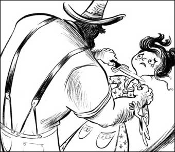
Great cartooning on display in this adaptation of an old ballad by Rebecca Dart (via DD). It reminded me a bit of both Cyril Pedrosa and Craig Thompson, but with a flair all its own.

Dart’s been in animation for a while, with occasional stabs at comics, but I hope hers is a name we’ll hear more of in connection with comics in the coming years— especially after checking out the lively and original artwork in her other recent Livejournal entries (some NSFW).


What’s Your Comics-to-Crap Ratio?

Douglas Rushkoff is offering an online preview of a new comic called X (Heidi’s comments here). Looks like a fairly cool comic, with some pretty art by Cheoljoo Lee and Younger Yang. And as usual, the format got me thinking.

The preview is your basic repurposed printed comic book on the screen (*sigh*), but looking at the tiny, unobtrusive controls on the lower right of my screen, I realized that one of its strengths (offsetting the annoyingly long load times) was the high ratio of screen real estate devoted to comics versus navigational elements.The controls and loading bars were as tiny and unobtrusive as possible, (and the preview doesn’t blur everything between spreads for no reason which is a plus).

So I thought, hey, there are really only three types of pixels you’re going to be looking at if you sit down to read a comic book or graphic novel on the screen. There’s (1) the comic, (2) the controls, and (3) the crap—”crap” being logos, chatter, ads, useless branding, etc.

I figure most readers would want the ratio from 1 to 2 to be as big as possible. On my admittedly big screen, the preview’s comics-to-controls ratio is a whopping 170 to 1. Not bad!

And where the crap is concerned, I’d think that most readers would want the crap to go away entirely when they settle down to read a long comic and sure enough that’s what the preview does.

As usual, this doesn’t really apply to strips which have always thrived in a sea of distractions; and I’d still favor arrow keys or the spacebar over hunting and pecking; but where the long form stuff is concerned—the online equivalents of comic books and graphic novels—I just thought it might be useful if we artists took a moment to consider our comics-to-controls ratio, as well as our comics-to-crap ratio.


Beetlejuice! Beetlejuice! Beetlejuice!

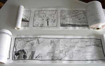
Rudy Rucker writes to let us know that this Thursday, his daughter Isabel will debut “Unfurling,” a 400 foot long graphic novel drawn on a scroll of paper, at the SOMArts gallery in San Francisco. It’ll be on display through the 27th.

I didn’t see Rudy’s entry at first. Cory Doctorow at BoingBoing saw it and wrote about it Monday, but I didn’t see Cory’s entry right away either.

No, the reason I know that Cory Doctorow knows that Rudy Rucker’s daughter has a 400 foot long graphic novel scroll at a gallery in San Francisco is simply because the first comment on the BoingBoing thread (by “Shay Guy”) was “Somebody tell Scott McCloud.” And I was ego-surfing.

In the movie Beetlejuice, I always figured that the idea that you could summon the demon just by saying his name three times was meant to have a sort of childlike campfire ghost story quality to it. Ridiculous, but in a kid-logic, dreamtime way.

In Zot!, I played with the idea that all anyone had to do was type the proper name of my electric assassin 9-Jack-9 into any terminal anywhere in the world and he would appear. I figured that the unique quality of the name “J9AC9K” made the chance of anyone accidentally typing it infinitesimal, and therefore give it a certain weird credibility.

Beetlejuice! Beetlejuice! Beetlejuice!

J9AC9K

“Somebody tell Scott McCloud.”

“Any sufficiently advanced technology is indistinguishable from magic.”

— Arthur C. Clarke


Welcome, Juni!

Congratulations to Amy and Kazu on the birth of future master of the universe Juni!!


The Letterers

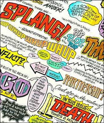
The celebrated letterer Todd Klein was interviewed last week. Some find hand lettering tedious and prefer using fonts, but there’s no question that Todd’s hand lettering was a thing of beauty no font will ever match (though even Todd himself is working increasingly in the digital realm).

Still, after reading how he got started, I had to laugh at the thought of Todd on the job at DC for the first time (doing the sort of correction and paste-up in the production department that I would later do in the desk next to Todd’s in 1982) thinking to himself: “Boy, this sure beats putting together instruction manuals for air conditioners!”

Todd lettered Zot! #1 and did the final version of the Zot logo. All but two of my subsequent comics, through Understanding Comics, were lettered by the great Bob Lappan. Since then, it’s been all fonts for this control freak, but I still consider the approach a work in progress, and there’s always a chance I might hand letter a (probably short) comic in the future.

I do still hand letter my rough layouts and try to make them readable for my editors. Even on the Cintiq tablet, zoomed in at 800 dpi to save my wrists, my technique is still the similar to what Todd taught me all those years ago.

(link via Dirk)


Comics without Pictures, Take Two

The deadline is coming up fast, but if anyone is interested, here’s a challenge to create a text-only comic (complete with prize) which some of you may want to take up.

As before, I’m sure the whole question of what even qualifies as a “picture” will come up, but I’m happy to let others decide that.