webcomics
print
inventions
presentations
consulting

Archive for ‘Technology’


Flash Forward

Salgood Sam pointed me (via Twitter) to Manmachine by Martin Hekker, which uses a simple Flash-based side-scrolling thingey that doubles the cursor speed for fairly seamless navigation once its all loaded  (“programming by Mike Angstadt” so I assume this was Mike’s doing).

[Correction!: The audio is Flash-based, but the scroll-thingey is Javascript-based. Thanks to Andrew in the comments section for the heads-up. (Way to ruin a good pun, Universe).]


Speaking of Neal Von Flue…

this collaboration with writer Alexander Danner from 2005 is five kinds of wonderful if you’ve never read it. Reading it again yesterday, I was reminded of Neil Gaiman at his most dry (and most succinct—it’s a quick read). 

Neal Von Flue used the original “infinite canvas” application developed at Vienna’s University of Technology by Markus Müller under the supervision of Peter Purgathofer in 2003-2004 (not to be confused with Microsoft Live Lab’s recent experiment). The app isn’t being actively developed anymore, but a few artists gave it a try with some cool results. The implementation on Alexander and Neal’s story is simple, but I think it adds a lot to the reading experience.


I Will Beat this Horse Again and Again until it RISES FROM THE DEAD

What’s the default shape of our art forms?

Cinema is wider than it is tall. TV is wider than it is tall. Theater is wider than it is tall. Laptop and desktop monitors are wider than they are tall. In fact, with the advent of widescreen TVs, there’s little difference in the shapes. They’re all around 3×5 or 4×5 range. Wider than tall. All of them.

And print? Well, print is taller than it is wide right? The printed page is the exception to the rule, isn’t it?

Wrong.

The default shape of print is not taller than wide. It’s wider than tall just like all the rest, because the default shape of print is two pages side-by-side. And the reason is the same reason as the shape of TV and cinema and theater and surfing and all the rest: because we have two eyes next to each other, not one on top of the other.

I don’t even have a Kindle yet, so this isn’t meant as a specific critique of the device. And I’m sure its engineers had solid practical reasons to design the device the way they did. You can even turn it sideways when needed.  It just reminded me when I went to Amazon this morning and saw images of the latest, how design principles in the wild can always be adjusted on the fly, but as soon as they’re embedded in hardware, they tend to stick around. For decades in some cases.

So if I could humbly suggest a new cardinal rule of designing anything meant to be read (including webcomics): Step #1, look in a mirror.

[Edit to add: Within ten minutes of posting, everybody has agreed that I’m utterly wrong about this! Oh well. Check the comments thread to see some smart, funny rebuttals.]


Two Scrollers

Courtesy of the New York Times this week, Maira Kalman’s And the Pursuit of Happiness is an enjoyable meditation on laws and those who preside over them.

And since Kalman’s comic is presented in one big scroll, it gives me a hook to also link to Dash Shaw’s gargantuan scrolling Bodyworld webcomic (completed earlier this year) which I’ve been meaning to blog about for awhile.

In principle, I always liked the idea of putting comics all together on one page; the idea being that readers could just hit a button or touch their scroll wheel and just use that one method to move all the way from beginning to end. I used the format myself a lot in my early webcomics.

It saddens me, though, to note that the big drawback of scrolling in the early days still hasn’t gone away after all these years. Most browsers still update images every few pixels while scrolling so that the entire page flickers and jitters all the way down until it stops. Dude, it’s 2009! Why does scrolling still hurt my eyes?

Ah, well. Still holding out for multi-touch laptops that scroll like iPhones. We’ll see…


Ruben and Lullaby


Okay, not comics maybe, but you might want to check out this nicely executed choose-your-own-emotion game/story thingey by Erik Loyer and Ezra Clayton Daniels that I just downloaded to my iPhone.


Prezi + Webcomics = ?


The online presentation tool Prezi goes into public beta this week. It’s a zooming interface designed for presentations which caught the eye of a few of us in the lunatic fringe as having potential applications for you know what.

Neal Von Flue posted an in-depth look at the comics implications of this new tool on his Facebook page when a few of us got advanced notice of the private beta in February. Unpack the comments thread for input from Krisztián Kristóf, a cartoonist and developer on the Prezi team who is also considering these issues.

Together with developments like Microsoft’s embryonic Infinite Canvas Alpha and the likelihood of multi-touch netbooks in the near future, Prezi may be part of a general trend toward continuous-space navigation in communication and the arts. If that’s the case, I hope comics will be a part of that trend.


Microsoft, Seadragon and the Infinite Canvas

I first saw Microsoft’s Seadragon and Photosynth projects via Blaise Aguera y Arcas’s stunning demo at TED 2007, and of course, I immediately thought of the implications for my “infinite canvas” ideas. Apparently, I wasn’t alone. Last spring, I got an email from Ian Gilman who worked with the team, to let me know about his efforts to apply some of these ideas to comics and pointing out Seadragon’s baby steps on the Web. Though those efforts are only peripherally related to Seadragon so far, the proximity is interesting.

Art by Paul Sizer from his intro to B.P.M.

Art by Paul Sizer from his intro to B.P.M.

Microsoft’s Infinite Canvas, listed as “a funky side project” from Microsoft’s Live Labs, is still just in Alpha testing. It’s not as smooth as Merlin’s Tarquin Engine by any means, but it does introduce a community element and the instant gratification of being able to hit that “create” button and try it out right away, which could lead in some very interesting directions. I even threw a vintage improv up there to try it out.

The results are scattered, of course, and not every comic uses the same navigational model, but it’s definitely worth looking at and playing with.


About “About ‘About Digital Comics'”

It took about 3 minutes in the mid-’90s for comic strips to take to the Web; like those newborn babies dropped in water that instantly know how to swim. If an online comic strip looked like its printed cousins, it was just as readable. If surfers had short attention spans, no problem. The Web was one big refrigerator, covered with magnets, waiting for something short, funny and recognizable to snap on to its audience.

Long form comics (the online equivalent of comic books and graphic novels) have had a harder road to follow. Fewer readers have the time or stamina for a web-based Maus or Watchmen during precious coffee breaks at work. And long, serious comics don’t always lend themselves to the kinds of conspicuous ads and light-hearted merchandise that have kept many daily strips afloat. Still, if a young artist is passionate enough to create a long form masterpiece they won’t let these limitations stop them and sooner or later they’ll find an audience.

But there’s one more obstacle, which is far more infuriating because it’s so pointless and unnecessary: The page designs of most long form webcomics suck donkey dick. Good artists and writersincluding some of my favorite cartoonists in the world—force readers to sroll, then click, then read, then scroll, then read, then click, then scroll again for no other reason than a stubborn belief that all comics pages have to be taller than wide, and that all web pages need a metric ton of blinking crap at the top to work.

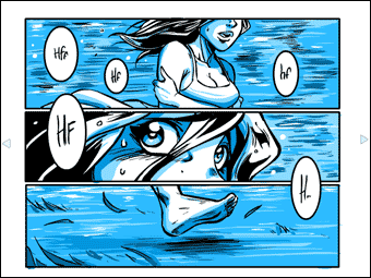
Long form comics are different from strips. If a cartoonist wants their readers to stick with a 60-page story about their Moroccan grandmother’s struggle with Diabetes, they need that reader to lose themselves in the story. That means keeping readers’ eyes on the page. Every time a reader looks away to navigate, they’re leaving the world of the story, and returning to the world of scrollbars and links.

The simplest solution—choosing screen-fitting pages and putting them near the top of the screen—is not rocket science. Charlie Parker’s Argon Zark did it over a decade ago (screens were smaller then), Justine Shaw, the first webcomics artist ever nominated for an Eisner, created a near-perfect format with Nowhere Girl in 2002 (making the entire page a next button), and Larson and O’Malley’s wonderful Bear Creek Apartments from 2008 had no trouble getting thousands of readers to click to the end. 

But still the madness continues, and every day another dozen artists put their comics online using a format every bit as a annoying as a TV show that automatically changes channels every 3 minutes, while a four year-old stands directly in front of the screen, screaming the theme from Barney.

Which brings us to Yves Bigerel.

A lot of people have been pointing me to Yves’ two webcomics about webcomics over the last couple of weeks. If your own attention spans aren’t too taxed already, I hope you’ll consider reading both now from beginning to end (should only take about 6 minutes, they’re not too long):

About Digital Comics

About Digital Comics


About About Digital Comics

About About Digital Comics


Now, there are about a dozen issues raised in these comics that I’m not going to touch on. He’s actually heading in some directions that I’d be reluctant to go. But there’s no question that these comics struck a chord with artists and readers in the last few weeks, including me. And I think that one of the most refreshing aspects (“refreshing” as in a cool drink of water after five days in the desert) is the fact that navigating using Yves’ system is as simple and intuitive as breathing.

If that’s the message more cartoonists take to heart in the coming months, we may see some progress yet.


Making Faces

The Grimace Project is a freakishly cool facial expression generator that came out a few weeks ago in which you can mix and match any two of the six “emotional primaries” that I charted in Chapter 2 of Making Comics.


The project comes out of the Vienna University of Technology under the guidance of Peter Purgathofer. The team kindly acknowledges me, but credit is equally due to my own inspirations for the charts, artist Gary Faigin and researcher Paul Eckman — not to mention Mr. Darwin.

Facial expressions should be taught in every grade school. Just because kids can “write” and “read” them through instinct is no reason not to help them understand this powerful communicative tool we all carry around on the front of our heads. Widgets like the Grimace Project could be a great starting point.