466 Pages at a Glance
Spoiler Alert!
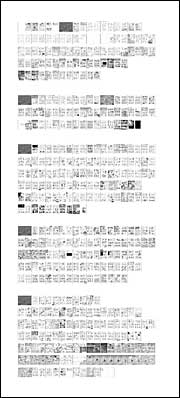
Just for fun, here’s a distant screenshot of all 466 pages of my rough draft layouts for my upcoming graphic novel (working title The Sculptor). This is as close as I can bring you right now, but as work goes on in the coming months, I promise to show some actual art.

It’s a testament to the speed of today’s processors—well, 2007’s processors—that what you’re looking at actually exists in a single file and if zoomed in, the lettering is readable. To get a sense of the scale, each of those dark gray rectangles is a two-page spread chapter divider.
When heading into rewrites and restructuring, it’s always helped me to step back and look at “the big picture.” For all my previous projects, including the all-digital Making Comics, I had to depend on paper layouts to get that kind of topsight, but for this project it’s all pixels from start to finish.
Oh, and yes, I still plan to make it shorter during the next two months, even though I had to adjust the count upwards from the last blog post.


Scott; I’m really looking forward to the new book (hope it gets a new name)—I think Zot! is one of the best comics ever made, and I love Making Comics, but please—spoiler alert?
I was looking forward to reading it fresh.
Just for you, Sandra (and because it’s kind of funny) I added “Spoiler Alert!” to the top. ^^
Thank you so much, Scott! (Hope it will save someone else, at least.)
I’m clicking and I’m clicking and nothing’s happening! You are SUCH a tease!
What app(s) are you using for this work, Scott? I’d be curious to learn more about your workflow, especially how its phases correspond (or fail to correspond) to those of traditional comic book creation: pencils, inks, colors, etc.
High on my to-do list is a full accounting of this, but for now:
Illustrator for lettering and borders. Photoshop for everything else (including my layouts).
Thanks for posting this. I always enjoy insights in to artistry!
I love it! The dialogue really sparkles. By the way, I spotted a typo on page 146. You meant meant “gravitas,” not “gravatas.” Hope that helps.
I’m sure you don’t want to show off any of your pages, but I’m curious to see what type of detail you put into these roughs. Sometime could you make a fake page with the same amount of detail and put it up? I think it would be pretty interesting.
(That would have been funnier if I hadn’t repeated a word. Oops.)
oooh nice… *squints*
How do I get this read this!
Congrats, Scott!
As you must be aware, The Sculptor is the single most awaited graphic novel of all time. I’m sure on the fateful day that the book lands in our hands, just seeing your name on the cover will call to mind the years of excitement and anticipation locked tightly into each and every page of the book and some part of us will hold if not most than all those feelings of excitement and wonder how it was that we should so intensely have read through to the end again.
Well, it started out okay, but it was down hill once Dekko shows up with the dancing robots, and I saw the ending coming a mile away!
One thing that jumps out at me was the appearance of several dark/black spreads…I wonder if they simply are night scenes, or something more abstract…
Well, I could not see the pages by zooming, as I am working with IE6 (!!!) on my office machine. But will definitely have a look when I go home.
Scott, just one q. Where do you get all this patience of working on such detailed stuff again and again? I have read the Zot! comics omnibus, and the drawings are sooo detailed! I do try to match that, but sometimes it gets overwhelming.
Just to clarify, this is as close as I can let people get at this point. This was just a “tease” as MIke L correctly notes.
Since the book won’t be out until late 2013, I’m trying not to show much — at least until I do some finished art.
As for shortening it; cutting 10% is the rule I try to use for my stuff.
10% would be just about right, actually.
Any plans to sell this as a poster, perhaps once the title ships?
Does the width of the “calendar” affect how the story is read?
(If you cross your eyes just right, you can see a 3-D dolphin.)
No plans to posterize it, but who knows?
When doing the day-to-layouts, I worked 40 at a time in two rows, but I was still thinking in terms of traditional 2-page spreads once flow issues were settled. And of course readers will just get a traditional book when the dust settles in a few years.
Yuk! And today you’re at http://www.afnews.info 🙂
Scott,
What size and resolution is the file?
When you talk about stepping back and looking, is this on a monitor or do you have a printout on the wall?
At 150 Dots per inch, this file is approximately 80 feet wide and 200 feet tall. But there’s no paper version. Takes about 5 seconds to open the file, though it would be a bitch to save changes regularly, so I mostly worked a “mere” 40 pages at a time (see above).
When I say “distant” I’m just speaking metaphorically though. I haven’t printed it out or anything. This is just a drastically downsized version.
[…] quadrinhista Scott McCloud publicou todas as 466 páginas de sua mais nova graphic novel. O problema é que a imagem, publicada em seu blog, é tão pequena, que nem mesmo uma lupa é […]