


When Metaphors Touch Down
 Long-time friend of the site, Greg Stephens suggested I check out this article by Tokyo-based Craig Mod which offers his take on different contents’ ability (or lack thereof) to migrate easily from device to device.
His whole presentation has an amusing vintage-Tufte meets RC-era me feeling, and some of the reasoning may be a bit fuzzy, but his ideas are fun, provocative, and worth a look—as are the many comments that follow.
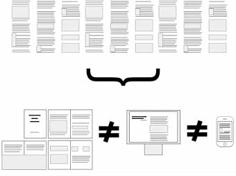
Craig’s main point—that there are types of content that can’t be endlessly re-flowed and re-purposed because their formal presentation is integral to the work—is a huge issue for comics and the source of a lot of our growing pains to date.
For years, I’ve watched as we’ve tried out a dozen different metaphors for comics on the Web. Pages versus windows, flipping versus panning, “strip” versus “magazine” versus “book”… all the while assuming that the best metaphor(s) would simply win out in the end on an open network.
What worried me is that sooner or later, one or two of those metaphors were bound to migrate to dedicated reading devices, and when they did, the designers of those devices could simply choose which metaphor suited them and lock them in. For a really long time.
If such devices follow an app store model, such experimentation doesn’t have to stop dead in its tracks. Maybe. But there’s no question that “later” is becoming “sooner” is becoming “now” and if we don’t make some smart decisions during this stage of growth, comics could veer dangerously off course for years.
The labor to establish a metaphor sounds like labor to create an additional layer to obstruct understanding.
What we call experience we also call three- or four-dimensional. What Craig Mod refers to as formless content, a model he establish for logical parsing, seems to simply refer to the one-dimensional nature of text, which gets pulled into a two-dimensional experience when you consider the stacked-nature of carriage-returns and pages as they are printed.
Comics are lines and shapes of expression pulled into two-dimensions, experienced as three-dimensions when they are printed and stacked as pages, then possibly experienced more purely as two-dimensions again when tailored for the infinite canvas of the screen, or beheld as an ingeniously composed page.
Film is the two-dimensions of the display + the dimension of programmed time = three-dimensions.
The medium then allows the dimensionality, whether it’s the one-dimension of text printed on the page, the two-dimensions of line and shape displayed on the one-dimension of the screen (if not more) or the two-dimensions of a stack of pages, or two-dimensions projected in programmed time.
All other considerations — like what Mod’s article refers to — seems to fall within a subset of this observation. But the real gap seems to be between the talent of the creator to pull out of and pack into the dimensional limitations of the selected medium, and the experiences of the audience the creator must access for anyone to care about what’s being presented. That’s how it seems to me unless I’m missing something from what’s being discussed. But all of these additional layers seem to distract from the labor of making anyone care about what you’re presenting (like I should talk).
Craigs article is very interesting. Definately brings Reinventing Comics to mind!
I posted a long comment on the site, but one of them I want to share here:
I’m working on a comic-book at the moment so my interest in the iPad is high. But I still can’t imagine I would prefer reading a comic on a pad or e-reader, more than I would on paper.
One thing I’ve noticed – even with my own work – is that I spend far more time lingering on a page with a printed item than I do reading anything on a screen. I tested this recently by buying a printed copy of Freak Angels, which I normally read online. Surprisingly I spent far longer with the printed item and I noticed things in the art that I hadn’t seen before. Not because of visual quality issues, but because I spent more time looking at it.
Will the iPad remove the tendency to skim through things quickly in a digital form? I’m not sure it will…
I like the idea of printed books stepping up to the challenge of embracing their form. It’s always neat to see that happen, and I know I’d personally hate to see the printed page go.
I think infinite canvas stuff is super cool for comics and visual art. As far as arranging formless text into infinite canvas mode, eh, I think page breaks help me to focus on the task of reading and not be overwhelmed by the length of a chapter.
What I’ve been doing with some of my comics is to just put the images in the html as simply as possible, and thus they just reflow as you resize the browser window. Make it thin and you only see one image per row; make it wide and you see maybe three. No javascript, no flash, just a bunch of sequetial img-tags.
Sandra… that works really well. simple but very effective!
Agreed. ^__^
Sandra, did someone put the inline style value in the body-tag of your code by hand? You can set yourself up for some control to play with by removing the inline style, and instead styling your single paragraph from a stylesheet embedded from the document head. Then if you want to try something like establishing left- and right-margins, you can set a width and set the left- and right-margins to auto.
I don’t know what your comic says, but I like how you portray public phones, and the relief-nature of some of your panels.
Yeah, I did. I figure it validates, it’s easy enough, and if I need more reusable stylings I’ll add a linked css or a css block in the header, but this is fine for now. I have two guidelines: 1. Keep it simple, and 2. rely on as much browser defaults as possible.
Sandra, your page still literally has an html layer and a css layer. Segregating layers is simpler than integrating them with inline styles in your tags. Perhaps not easier, but simpler is your stated standard, not easier, and I can see how you’re showing the work to stay simple (which is why I’m thinking my intrusive suggestions are welcome). Rather than embedding an inline style for each image like you have, you could establish the style with a single line in a stylesheet.
Also, html 4 and xhtml 1 strict are only really necessary to style div-tags, which you aren’t even using. Transitional standards are still actual standards and allows a page like yours to keep some netscape3- and ie3-era html-styling to remain forward compatible (as well as allowing the css-styling of div-tags). With xhtml transitional, you can center your p-tag inline, border-values in your images — and make your page css-free.
Also, even when the browsers completely abandon quirks-mode, html 3.2 — the pre-css-standard — should still remain an allowable standard for undressed pages like you seem to intend. Then you lock-out the css layer, and only have to worry about the html layer. Quirks-mode is the browser-mode representing the greater imposition on the system (sort of like automatic transmission versus stick-shift — thus part of the urgency to push standards-compliance is to allow coders greater control to display their pages on anyone’s virus-infested bot-zombie) but you want to gear pages so that even quirks-mode represents no greater imposition on the system.
1. Oh, I realize now that you meant to put the margin:auto–stuff on the p, not the img:s. Yeah, or I could just tweak the body padding if I wasn’t satisfied with the browser default margins.
2. I don’t get this about quirks mode. Are you saying that ko te morji triggers quirks mode? Or that it should?
3. As for why I used inline CSS rather than a separate file, I’ll send you an email so I won’t hi-jack Scott’s blog.
1. that too, although the solutions aren’t interchangeable.
2. no, your page displays standard-mode. Just saying if your code validates to a standard that still triggers quirks-mode, I’d say keeping things semantically super-simple is more pragmatic than not-as-simple code that validates as and triggers standards-mode.
3. the code of your page looked like it was mostly program-generated (ie, no broken code). But as long as you’re hand-coding from your professional practices, no, my ideas aren’t as simple as coding from your tested common sense. But I stand by what I’ve said for anyone else who has yet to think through these kinds of decisions.
Thanks,
Mike
1. Right, I see—the fixed width + margin:auto would be just for centering, not setting the margin. Sorry I got those mixed up.
2&3: Thanks for the clarifications.
Thanks for the kind words!
For this flowing thing, using the margin:auto wouldn’t work so well since I need the images to be able to line up next to each other when the window is wide.
For some works, when I want the images to line up neater, I put all panels the same height, and the same width or use a multiple + the padding + the border width to make sure panels look neat together. For ko te morji I just made the heights equal.
Btw, I really love reading things like Scott’s Hearts and Minds, it works well. I’m very influenced by Scott’s comics but I wanted to strip it down, simplify, through out all table-layouts and fixed css and just trust in the browser and the reflow model, giving a lot of choice to the user.
Lot of misspellings today—that’s supposed to be “throw”, not “through”, and “sequential”, not “sequetial”.
This method works well with the zooming function in many browsers, too.
I’m so happy, giddy that someone likes it! I’ve only been drawing comics for a short while, since I read Making Comics.
You know. Movies are shot differently from TV because both are different formats. Though it would be a lot of work, it would make sense to me for the creator REALLY determined to get their work on every platform to make a version of their comic for every platform.
The web browser version, the print version, the crappy to look at smart phone version…
This is why I think we need to work on a common format for comic presentation, which various apps could read.
I wish I had time to finish my own infinite canvas experiment, but that was effectively just a reader for an xml list of images and their positions. (more or less). It gave the creator of the xml a lot of flexibility. I even figured (with minor markup additions) they could choose to make pages if they wished. (it would really be just jumping to locations on the canvas internally).
I think the key with anything is to have open, pubic, standards.
Its the same with my work with augmented reality.
As long as we are tied to specific implementations of solutions the creators will never be really free to experiment.