Gingerbread Girl
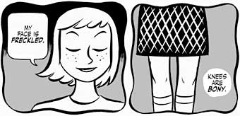
So, there’s this silly, adorable, sexy little comic (NSFW, but only barely so far) called Gingerbread Girl by Colleen Coover and Paul Tobin running on Top Shelf’s ts2.0 section.
Like, I assume, all of the comics on ts2.0, Gingerbread Girl can be read online, but they’d really like you to actually buy the book. Which is reasonable, of course. They are a publisher.
Thing is, I really like the web presentation when you first get there. It’s clean, nicely designed. Colleen’s black and white artwork looks great online and they’ve thoughtfully broken the pages into two tiers each so they’ll fit on most screens.
Best of all, when I’m done reading Page One, I can just click and Page Two instantly loads. And when I’m done reading Page Two, I can just click and Page Three instantly loads. And when I’m…
Oh.
 *sigh*
…which is not true, because there are five more parts online already that I can read.
At this point, if I want to keep reading, I can ignore the alert box, find the drop down menu at the top or bottom of the page (maybe with a bit of scrolling), see the options to remind myself which installment I’m on, based on which installment is missing from the context sensitive menu (sophisticated touch, that) and select the next installment.
And… back to reading!
Fortunately, I only have to do this every three pages so it’s not distracting. No, not at all.
Is this what we’ve come to? When even the best designers (again, I like the way ts2.0 is designed for the most part) have to degrade the reading experience online for fear of making the print version superfluous?
2011, People.
2011.


Amen. Fear destroys all intelligence.
NSFW? Really? For a drawn artwork that doesn’t have any explicit nudity, except in a nonsexual context? And that’s pushing the envelope pretty hard to classify a naked butt as “nudity”. I think at most workplaces, looking at comics would be the problem, not looking at comics with a naked butt in them.
Fear destroys all intelligence, indeed.
This is 2011, people. *2011*.
And that’s even overlooking the greatest transgression of all — no RSS. I don’t read webcomics with no RSS. I mean, I’ll save the link somewhere thinking I will look at this again sometime, but then because there is no way to subscribe directly, I just never end up going back. So the result is that if you make a webcomic with no RSS, I won’t read it, not because I’m a stickler or anything but because you have just failed to successfully insert yourself into my routine. Such is life, tra la la… looks good, though.
Yup, I’m the same way. There are 2 or 3 webcomics that I go out of my way to read even though they don’t have an RSS, 2 of them because they were webcomics long before there was such a thing as an RSS feed and their page designs haven’t been updated in 10 years, but other than those, if a comic doesn’t have an RSS, there’s no chance I’ll remember to check up on it.
Concerning RSS:
I’m glad you (and the person commenting right after you) mentioned RSS feeds. I’ve never thought of it much myself. But when I eventually start posting comics to the web myself (not there yet), I’m pretty sure I would have neglected an RSS feed. Thanks for mentioning it. 🙂
I’ve LONG had such an art crush on Colleen Coover. It doesn’t surprise me to see her work gaining fame. But damn, yeah, 2011. We can do away with what is essentually a pop-up purchasing ad.
ugh, the whole ts2.0 project seems like such a token “we’re supporting webcomics!” gesture. my default reaction is always to click on “back to ts2.0,” which takes me away from the comic entirely!
i’ll buy the book! i promise! but probably not if i get too frustrated reading the “preview pages.” (i lie, i will buy this book anyway. but maybe not others. i’m certainly not going browsing through their site for more work i like.)
agreed on the rss thing. your viewers are more important than your ad views.
Yup, that is inexcusably terrible. So much so that there’s no chance of me reading the comic, and therefore no chance of me ever buying a book of it. That header that shoves the page down every time you mouse over it is hugely irritating too.
There is an RSS feed — the RSS logo is in the orange header that um, only shows up when you mouse over it.
I really want to buy this book, but they make it difficult! There’s no “buy me” link anywhere on the comic page — one has to go to the “Catalog” page and hunt around for it.
No that RSS feed is for the entire Top Shelf site, not the webcomic in question.
Never mind. There are two RSS links, the usual one in the address bar, and the one further down. I was looking at the top one. The lower one does appear to be more specific to the webcomic, or at least, to posts from Colleen. So I got misdirected and my comments above don’t apply — sorry.
Also… subscribed! 8)
Thanks.
Except wait… there *are* other webcomics besides Gingerbread Girl at the lower link. The two feeds are different — one is comics and one is news — but neither of them is specific to Gingerbread Girl. Basically TopShelf wants you to subscribe to all or nothing. A dangerous ultimatum in my book.
One other problem with the ts2.0 implementation, which it shares with the old MySpace Dark Horse Presents. If a page is taller than one screen, and you have to scroll down, and then click for the next page, you start at the bottom of the next page, and have to scroll up, which really messes up the rhythm. To read it properly, you have to scroll down, finish reading the page, scroll up and then click. That’s not counter-intuitive at all…
haha, yeah, I went back to be certain about the rss link too.
I see that most of their comics are one shots and not “chapters” like Gingerbread Girl, where the user interface makes more sense. it’s frustrating that they didn’t account for serialized comics with regular updates, though.
This comic intrigues me… I wish the ‘chapters’ were actual chapters rather then 2 to 4 pages though and that it was a little less frustrating to get to each installment
So it’s 2011. Absolutely. But no one seems to have decided what that means in regard to interface yet.
Things that we would expect to see out of a sophisticated webcomic like RSS and clean momentum through many pages of content might not be instep with the goals of a newer website like ts2.0. The goal here is different than in earlier webscomics; they’re trying to showcase a free reading experience as a chance to build clients for the printed material. It’s a different goal with a different set of equations.
I’m not a code-guy, but my sense here is that system is set to make it easy for the site to deliver snippets of content from many different format size pages with little loading time; a “tasting menu” approach that I personally like for the site because it allows us to see a lot of very different material in a lot of different styles if only a nibble at a time. It means that casual readers, bloggers and newsies can come or link here, that there’s some communal and curatorial sense associated with the work on the site and that maybe, maybe with so much good new stuff happening in the world of comics these days maybe we need a “webcomics sampler” to help sort all that fresh new material (something I’ve been interested in for a long time…). In designing such a sampler, and having the potential sales of print as part of the business model that allows me to deliver that sampler for free to the public, I might not make RSS and a deeper page count for individual comics very high on my list of priorities. I’d probably want people to come back to the sampler as a whole rather let it be a pathway for reading the printed material for free.
But, yeah, it’s 2011 and we probably no a lot more now then they did in setting the site up way back in, oh, 2008. Here’s some of those things we’ve learned;
-interface navigation is key, but not static. You can’t entirely plan the user experience when so many new devices are creating new platforms of delivery. People navigate content on a phone differently than they do on a laptop or desktop. Don’t limit yourself to one method without ruling out the need for the other.
-Updates are key to user involvement, especially as we start having a greater chance to get new material “on the go” through mobile devices. But if the updates aren’t specifically tailored to the content we’re really looking for than they’re spam. Send me push messages, please, but let me chose the subject, theme and specific content that push message is about. If I read the technology section of the NY Times, I probably don’t care when there’s a new article up in the travel section. The same is true with comics.
-Mobile delivery means the opportunity for more specific community response not more topical homogenization. Hub sites and share-apps are beginning to form that make the sharing of cool content between friends easier. That’s how the whole popularization of geek culture happened in the first place. But if you start telling people that because they like Cheap Trick they’ll probably like like Journey they’re inclined to either tell you your wrong or stop buying your cheap trick. Unless we figure out a way to capture the momentum of community response that web-based media nurtures and allows in how we build new content then, well, we might as well be selling Journey t-shirts.
-The actual shape of the content we’re making has changed. Most of the comments on this post refer to that in terms of how we read and experience webcomics, but the comment from Bluus about “I wish the ‘chapters’ were actual chapters…” hits home the most. The page count and shape of comics were largely defined by the restrictions of print for a very long time, but those restrictions don’t exist any longer. In webcomics we’ve made them be about update and production schedule because we wanted to support artists putting out work whenever they can. But in graphic novels we want the whole story in our lap at once. I think we’re seeing a move towards a different balance of these two attitudes; we want chapter-based material that we can follow as it grows or assemble later for longer reading. Snippets and tasting menus are fine, but interrupting the flow of the story should be an artistic decision and not material one.
ts2.0 is a good site and great way to view exciting new material in comics, but it’s not, and has never been about, “bleeding-edge” design. So now, three years later in 2011, how do we do it better?
-R
For the folks who want a Gingerbread Girl rss, I suggest subscribing to the feed at http://www.colleencoover.net/ Ms. Coover updates every time the strip does.
You’ll also get the occasional sketch or painting from her in the feed, but that’s not a problem; it’s a reason to celebrate and hug strangers and scream “hurray” at the top of your lungs.
Awesome — thank you!
It’s sad that cbr and cbz files are still the most convenient way to read comics on my computer.