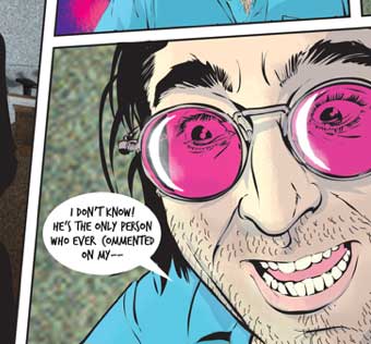
Dan Goldman’s Red Light Properties
 Dan Goldman has a new comic up at Tor.com which loads one panel at a time. Works pretty smoothly.
What’s interesting for me (apart from the art and story, of course) is how seamless it felt on a fast connection where the panels dropped in right away, and how jarring it was on a slower connection when the whole page vanished between loads. Speed definitely improved the reading experience.
Since the early ’90s, I’ve struggled to look past glitches that had more to do with temporary technological limitations to the various new format ideas artists have been trying out. I’ve tried to look ahead to a time when all those problems would be solved—like, say, 2010. Ah well. Patience, patience…
Dan has an interesting interview about the project with Seth Kushner at Graphic NYC where he talks about the story and the process, with a nod to Yves Bigerel’s Digital Comics which helped inspire the format.
[Edit: Last night uploaded an unfinished version of this post, since I forgot to save the final. Above is the final version.]


Good morning, Scott! I had a similar heart-sinking feeling just before we went live testing it over my reliably-mediocre connection here in Brasil: when the signal was strong, it was an exciting experience to read that way, but waiting 1-2 minutes between panels is just maddening, the comics equivalent of watching YouTube on dial-up. It had been my recommendation to Tor not to do the same thing in Flash; while it would load in one SWF, as it would’ve cost us all mobile readers and a good deal of web too (I’ve never understood why the instant vitriol people have for Flash; I think it can be elegant when used well).
Thanks to my squeaking wheels, the team at Tor tweaked the way their CMS handles the images before RLP launched and it got much better, and they promise to continue trying to squeeze the best performance possible outside of broadband sweet-spots. The reader does also give you the option to read it page-by-page instead, which cuts down on load times. I hope by the end of my run, it’ll be a consistently snappier experience for everyone.
The panel-reveal aspect of the comic was a neat idea to play with, but the story is the concern #1 for me, and I can’t have that mechanic standing between readers and my favorite story I’ve ever created. Like any experiment, I guess we’ll have to sit back and observe…
Hi Dan!
Checking this morning, I noticed that I’d forgotten to save the final version of this post last night (with mention of Yves B. and some other stuff changed). Just updated to the autosave above.
I agree that Flash gets a bad rap. Like Powerpoint, it’s a pretty flexible tool that may *often* be abused but certainly doesn’t have to be. I thought this use (at least on a fast connection) was pretty seamless, and I liked the back-up option of a full page advance.
But, yeah, the story is the thing—even for us mad scientists—and it looks like you have a cool one under way. Have fun creating and getting to know Sao Paulo! ^^
The stepwise build of the page is an interesting experiment, but (speaking as someone who reads a lot of comics) I always find frame-by-frame approaches to comics unsettling, unsatisfying.
Brian Clevinger used a frame-by-frame model to bring his Atomic Robo to the iPhone about a year ago. The result lacked scope, somehow, as the reader was limited to a very narrow window of the “now.”
Goldman’s stepwise build-in allows the reader to admire the full page, but only at the page’s end, looking backward. The experiment is interesting because it makes me acutely aware of just how much I let my peripheral vision work while reading comics. The white space to the right and below each panel kept beckoning me in a distracting way, and I would wind up pushing the forward arrow before I’d properly fully cognized the dialogue and images in the panel I was reading. Perhaps a black or grey background wouldn’t have this effect (white is very bright) but I suspect my expectation of something about to appear would pull my vision down and to the right anyway.