Lettering and Panel Borders in Illustrator (Post 1 of 2)

[NOTE: I’VE SINCE DONE A FULL VIDEO TUTORIAL ON THIS SUBJECT THAT EXPLAINS IT A LOT BETTER THAN THIS! CHECK IT OUT HERE.]
More cartoonists than ever are using fonts instead of hand-lettering. The results are mixed of course, but hey, we’re all learning.
Personally, I like lettering on the screen. One of the reasons is that I found a method I’m really comfortable with and that’s been very efficient and even enjoyable over the years.
I mentioned this in Making Comics and promised to explain in greater detail, so here’s that (long overdue) explanation.
The examples below are in Adobe’s aging Illustrator CS3 and should work with tweaks in even older versions, going back to at least 2005, and I assume newer ones. (I have CS4, but didn’t even notice I was working in an earlier version until I’d already captured videos of the examples—sorry!)
—
Part 1: Doing that Stroke Thing in the Appearance Palette
Our friend Nat first pointed out to me how useful the Appearance Palette could be when making balloons.
The idea is to make layers for the balloons and panel borders in which borderless white shapes would have a stroke appear around them when overlapped—which sounds boring, but is actually pretty cool-looking and incredibly useful.
VIDEO: Making a stroked layer in Appearance
1. Open Illustrator, make a new doc, etc…
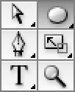
2. Using the “Window” menu, bring up the Tools, Appearance, Layers, and Color palettes (if they’re not already showing).
3. Make a big gray box with the rectangle tool (this is just to make the next steps easier to see). Lock the layer.
4. Create a new layer above the gray box. Name it “Test Layer.”
5. Pick any shape tool (rectangle, ellipse, star). Make a few shapes on “Test Layer.”
6. Select all the shapes and set their color to white fill, but no stroke. They should now appear as borderless white shapes (and you can actually see them ’cause you’ve got the gray box layer behind them).
7. Next to “Test Layer” in the Layers Palette, click on the little circle to the right to select all the contents of the layer (all those shapes you just made).
8. In upper right-hand corner of the Appearance Palette, click on the tiny pop-up menu symbol. From the menu, select “Add New Stroke.”
9. Still in the Appearance Palette, click where it says “Stroke 1 pt” and drag it down until it’s just below the word “Contents” (I’m sure there’s a more efficient way to do this, but I don’t care).
10. Try dragging your shapes around. Notice something cool: whenever the shapes overlap, there’s a black border around their combined shape only.
11. Think: “Hey! This would be awesome for word balloons and panel borders.” Pat self on back.
—
Part 2. Making the Classic Word Balloon Shape
There’s no “right” shape for word balloons, of course, but if you do choose the traditional round style, as most cartoonists do, I strongly suggest avoiding the unmodified ellipse. It looks butt-ugly and doesn’t hold words well at all (especially if the words are in a rectangular text box—Blech!)
This is how to get that classic balloon shape that’s evolved over a century of trial and error.
1. Keep that same document, but delete “Test Layer.”
2. Create a new layer called “Balloons” and another called “Text.”
3. Select the “Balloons” layer.
4. Select the ellipse tool.
5. Again, set color to white, no stroke,
6. Make a few wide ellipses of varying shapes.
7. From the Tools Palette, pick the Direct Selection tool (the open arrow symbol).
8. Click-select the far end of one side of one of the ellipses.
9. Squash the ellipse, just a little, by moving the (now visible) control point a small distance toward the center of the ellipse. Do the same on the other side. There’s no right amount, just whatever you think it needs. Feel free to squash a bit on top and bottom as well, though it shouldn’t need it as much.
10. Create a couple of tails as well, using the pen tool.
11. Select the contents of the layer “Balloons” (see Part 1, Step 7).
12. Add the stroked appearance to the “Balloons” layer via the Appearance Palette just like last time (steps 8-10 from Part 1).
—
Part 3: Creating Balloon-Fitting Text
Next you’re going to want a text area perfectly fitted to the balloon. With luck, you’ll rarely have to use the return key when typing in dialogue. The words should just flow naturally into the available space.
1. Using the same document you just made for Part 2, select the “Balloons” layer.
2. Select one of the balloons (just the modified ellipse, not its tail).
3. Pick the Scale Tool from the Tools Palette.
4. Click a little below the center of the selected balloon shape.
5. Shrink the balloon shape down about 70% by click-dragging the scale tool, while holding down the Shift and Option keys. (Basically, you’re making a copy, so now there are two shapes, one inside the other.)
6. Notice that the inner shape sits a bit low.
7. While the inner shape is still selected, pick the Type tool from the tools palette.
8. Moving the type tool cursor over the selected inside balloon shape, notice how the cursor changes appearance? When it’s just inside the balloon, it should change to a hexagonal shape indicating that it’s ready to put words inside the shape rather than on the outside. Go ahead and click there.
9. Try typing inside the small balloon shape. With luck, it should now be a round text area you can put words into.
10. Select the text box, and in the Layers Palette, drag its little color box on the right up to the “Text” layer (in other words you’re moving whatever is selected to that layer. (This is so that the words won’t have that stroked appearance that our balloons do, for those rare cases where the words might run outside the balloon).
11. Try resizing the balloon and text boxes.
—
Tomorrow: Adding Borders, and Creating the Your Own Template
…and why you’ll only have to do this stuff once!


I love these videos, but I was looking forward to hearing you talk during the video. I’m sure that would add a layer of difficulty for you, but you’d be amazed at how much instructional video relies on the human voice—and by how well it sells over on YouTube.
Ideally, I would’ve liked to do that, but wasn’t sure how to go about it (in fact that’s one of the reasons I took so long to get around to this).
Any suggestions for hassle free screen tutorial capture methods? Might still give it a try if it wouldn’t be too much of a pain in the neck.
Ooh! Just realized that in the third video, you didn’t need to change the border property on the new, 70% size ellipse is that the borders are being formed by the layer above the ellipses. Very cool.
Yup, you can apply the stroke appearance to a whole group of layers. Keep that group in your template and you only have to do this trick once. ^^
Tip: break the video making into 2 parts. Record the video with your favorite desktop capture program, then edit later to add the audio. This generally saves time because you don’t have to get both perfect at the same time. And it allows a little more flexibility in editing (as you review the video and notice things you needed, or don’t need).
Preferred software? (I’m on a Mac)
Hey Scott. Another option for screen capture if you’re running the newest version of OS X is QuickTime X. It has a built in screen and audio capture feature. Just run them both and go. Best thing is that it’s already on your Mac if you have Snow Leopard.
Scott: love it. Had no idea about the stroke-behind-contents thing. Huge time savings! Thank you!
Regarding capturing your tutorials with audio commentary, have you tried Jing? Pretty easy to use and it optimizes the video, making your file sizes nice and small:
http://www.techsmith.com/jing/
I love: “Show Dad how to use iTunes” as a possible use. ^__^
Pretty much everyone is still using CS3 Scott so I wouldn’t worry. That was the version that offered the biggest leap, CS4 and CS5 aren’t must-have upgrades, and at the obscene prices Adobe charges CS3 has gotta last a while.
Scott: My friend does gameplay videos and the way he does it is capture the video and audio separately. I assume since you have these videos, you’ve got the video part down, but you can use audacity to record your audio. Then you’d just go into Sony Vegas, or whatever video editing tool you’re using and stitch the audio and video together. It doesn’t take too much effort to learn how to sync audio and video either. Hope that helps.
Thank you, Scott! I struggle with this, it is one of my main slowing points when inking. I have made the transition from pencil to digital, but Illustrator is still a mystery.
Another screencapturing program is Screenflow…Love it! You can capture all at once, do callouts of where your cursor is add text, transitions, etc…
Ah, that one looks fantastic. Thanks!
Might actually spring for a copy.
There’s apparently handbook on the art of screencasting 😉 http://thescreencastinghandbook.com/
I’d second Jing as a great candidate. Use it all the time for my various simple screen capture needs. Marvelous free tool.
I like how quick and concise you made the tutorial videos.
I just noticed, the ‘line under contents’ thing also works with groups within the same layer. it makes it marginally easier to move a balloon group around, but it’s the same principle.
I use Illustrator (CS4) for anything I possibly can! My very favorite program, under Corel Painter!
I use my webcam for screen capturing… It’s a built-in webcam, and I just paid an upgrade fee to get desktop capturing abilities. So that’s all I know. :/
[…] More Links Soon… ‹ Previous […]
[…] McCloud’s Very Narrow Tutorial on Lettering (Source: Scott McCloud – Part 1, Part […]
[…] this is fun!: Using my morning blogging time this week to learn some new software (suggested in comments, thanks!) and put together a REAL video tutorial, with voice, covering last week’s lettering […]
[…] Part 1 – Balloons and Text […]
[…] using Adobe Illustrator. He makes it simple and easy to understand, and, after reading parts 1 and 2, you’ll no longer have any excuse not to finish a […]
[…] to “Craniumation” in last week’s comments section who suggested the program Screenflow to capture my desktop […]
[…] McCloud’s Very Narrow Tutorial on Lettering (Source: Scott McCloud – Part 1, Part […]