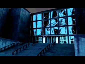

Got two emails in the last few days with links to two new webcomics using navigation techniques that neatly sum up this interesting technological moment we’re in.
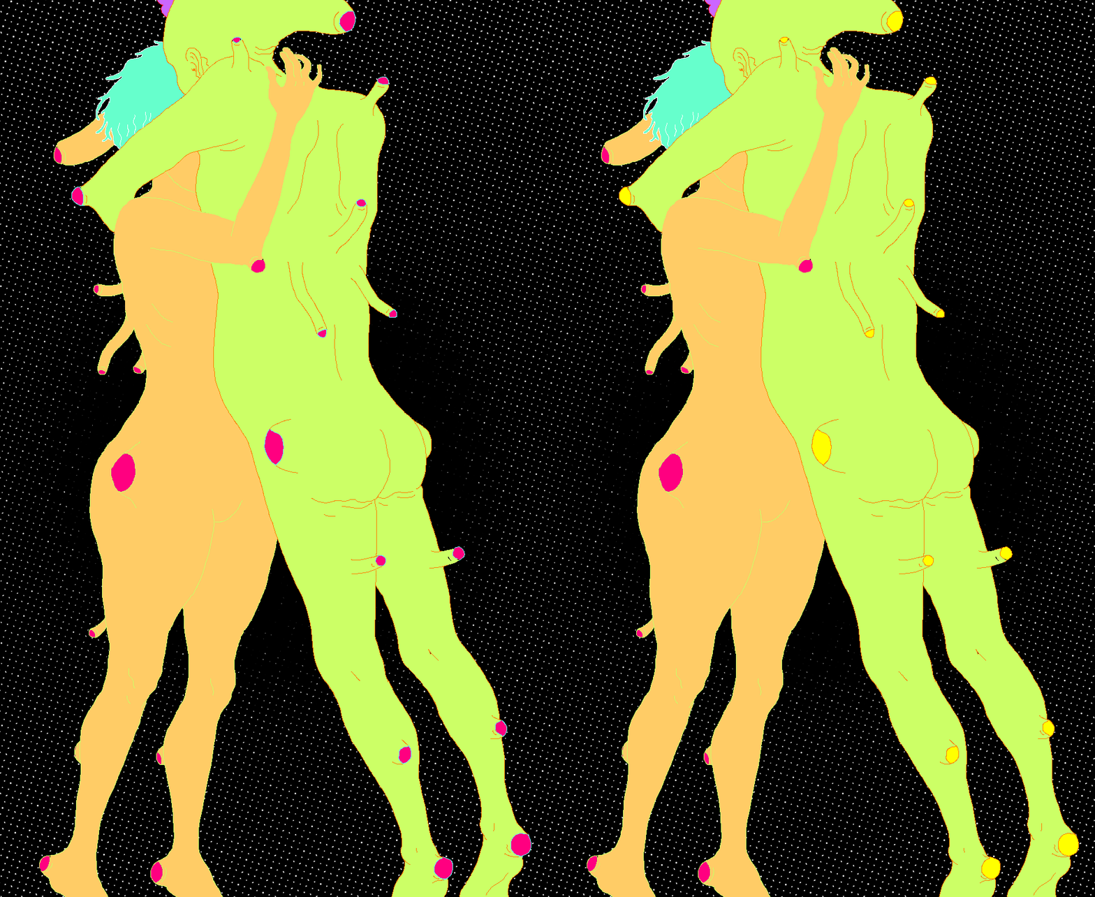
Turbo Defiant Kimecan by Mexican artist Ferran Daniel uses Flash to load one panel or element at a time. We’ve seen a few comics like it, but this one gets points for some pretty artwork. Curious to hear what people think of this sort of loading order, now that we’ve seen it a few times. (Maybe time to revisit this discussion?)
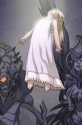
Meanwhile, along comes an HTML 5 comic, Never Mind the Bullets (cooked up by Steaw Web Design to show off Microsoft’s IE9). More proof-of-concept than anything else, but it’s kind of cool and got me thinking about how that layered effect could be used in other ways. (thanks again to Randy Oest for the tip).
Of course, the real shoot-out going on this year is between file formats, and with the recent back-and-forth in the mobile space over Flash and HTML 5, it’s helpful to have some concrete reminders of the very different creative directions each might take us in.
Impressions?
[Edit to Add: Since both are getting a sound beating in the comments section, I should probably make it clear that neither comic represent more than a tiny fraction of what can be (or has been) done with either Flash or HTML 5, and I’m not endorsing either approach as “the future of comics” or anything. But it’s always interesting to see how many different reading models there are, and even failed attempts can sometimes contain useful ideas.]


