webcomics
print
inventions
presentations
consulting

Archive for ‘Process’


I Don’t Know about You, but THIS is the Superhero Movie I’VE been Waiting for

I’m even okay with the ’60s Batman-style sound effects! Thanks, everyone I’ve ever known for telling me about this as soon as I got home.

Oh, and hey, as long as it’s Random Friday, I’ve got a question: I’m dying to find a reeeeeally old music video from the ’80s—maybe even pre-MTV. It had a funky, electronic song (possibly no words) with black and white, photocopy-style animation. There was a recurring assembly line motif with hamburgers and hands and that creepy masonic eye/pyramid thing. Really cool and jerky, almost like it was made by a robot Terry Gilliam. Does anyone remember this video? I’d love to find it out there somewhere but I don’t know anything about the director or even the musician(s) involved.

UPDATE: It was the experimental film “Machine Song” by Chel White. Thanks to music video master Alex de Campi for the answer!

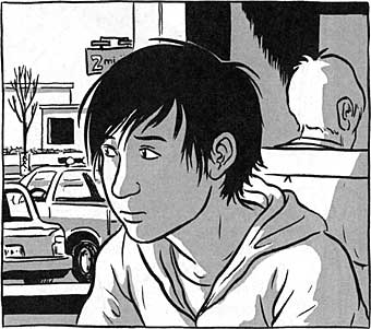
As some of you might have guessed, based on past blog entries, music is very important to our whole family. Sky is going to Coachella this year with a friend of ours and I’m envious, but after Italy, I’m going to be too eager to get back to work on the book, so I’ve got to miss it yet again.

I love that my daughter has been listening to bands like Passion Pit, Hot Chip, and Vampire Weekend* (all at Coachella) while simultaneously getting into Bob Dylan and Bob Marley, on LP no less—and that I had nothing to do with those last two. Well, any of them technically, (though I did discover Edward Sharpe and the Magnetic Zeros before her).

I used music constantly while working on the first draft of the layouts for the new book. I had several different playlists for different kinds of scenes and I’d go for long walks trying to imagine sequences, while letting the music sustain the mood I was going for.

Recently though, I mentioned this to my Mom over the phone and she said she hoped I took the headphones off once in a while to listen to the sounds around me too. (Which is both reasonable, and exactly the kind of thing you count on a Mom to say.)

Funny thing is, though, I’ve discovered that music actually distracts me during those walks now that I’ve entered the rewriting stage of the layouts. Keeping a sustained mood through music actually makes it harder to step back and consider the structure of a scene or set of scenes in my head, and how to change them for the better, or to implement the suggestions of my panel of “kibitzers.”

That trance I needed to put myself in while conceiving sequences would now prevent me from evaluating those scenes objectively. More proof, if any was needed, that we need to appeal to different aspects of our creative personality at different stages of the creative process.

Hm. This post is like a Simpsons episode. One thing leads to another and…

Uh.

See you Monday!

*Pop Quiz: If I added Peter Gabriel’s name to those three band names and asked you which of the four was not like the others, which would you pick and why?


That Hand on Your Shoulder

Interesting article by Joe McCulloch at Comics Comics regarding the scarcity of old-fashioned thought balloons in todays genre comics and elsewhere (via The Beat).

McCulloch pulls out a few examples of legitimate uses for the bulgy Edsel of comics iconography like Mazzucchelli’s picto-bubbles in Asterios Polyp, but he’s most enthusiastic for its streamlined descendent, the caption-style interior narration—especially the floating word bursts found in some manga.

McCulloch does a good job of enumerating the perceived advantages of thought captions (with or without borders) over balloons, but I’d like to toss out one more possibility.

The question I find most interesting is why do traditional word balloons seem more patronizing by their very nature? In Ware or Mazzuccelli’s hands, that quality is ironically re-channeled, but I think it’s still there. In the Shirow Miwa example that McCulloch offers, I think it’s there too.

In fact, I’ll go out on a limb and say that any thought caption made into a thought balloon is going to take on that patronizing quality, even if the phrasing is identical. It isn’t just the hokey word choices like in the above Ditko Dr. Strange panel, it’s the graphic device itself.

I don’t even think it’s the shape. The Shirow example McCulloch offers is just a jagged little slab—nothing goofy—but it still carries that spoon-feeding connotation for me. Even if it was a caption-like rectangle with square bubbles pointing to the character, I think the effect would be similar.

The important difference for me is that a thought caption—with or without borders—embodies each thought in a way that encourages us to assume ownership of it as we read. We literally bring each sentiment into existence as a thought, creating an instant bond with the character.

The thought balloon, regardless of shape or style, just by virtue of its pointer, brings a third party into the relationship: the author, gently putting his/her hand on our shoulder and pointing to the face of the thinker with the words “he thought.” Maybe thoughts are just too private for that kind of parental intrusion.

The fact that McCulloch reserves his most enthusiastic endorsement for modern Manga’s floating thought bursts feels right to me. If there’s one thing Manga has been doing right for years, it’s creating in readers a sense of participation in the lives of its protagonists. Participation in their innermost thoughts is a logical next step.


Palate Cleanser

While I’m happy to let Pixton and Bitstrips continue to trade stories of comics-making software tools in yesterday’s mammoth comments thread, let’s invite a hand drawn comic by the great John Porcellino into our hearts for a moment to restore a little balance to the universe.

Visit John’s long running King-Cat Comics site for more information on a small press legend and his sublime hand-tooled words and pictures.


How Do We Feel This Morning?

Want to draw comics for a living? Watch the video here three times in a row then come back.

How do we feel? Hmm?

Now…want to WRITE comics for a living? Watch. Any difference?

Seasoned vets can make fun of some of the oddball qualities of Clive and Daina Goodinson’s labor of love, but in its current incarnation, Pixton is pretty close to what a lot of young newbies have been asking for for years (I know, I get the emails!) and there’s clearly a lot of thoughtful design work going on under the hood.

Much like the Photo Comic software Comic Life, this appears to be a thoroughly user-centered venture. Users want it. Users will get it. And like Comic Life, I could see this continuing to find a place in classrooms, families, or around the water cooler.

The reaction of a lot of my cartooning peers may be a simple “GYAAAGH!” but this sort of thing never bothered me. The goal posts in the whole “only a human can do it” game are going to be moving a lot this century and I’m happy to dance around them with the rest of the creative community.


So Many Toys

Screwed around a bit with Harmony last night after work; a spare but fun online sketching tool that’s part of the ongoing Chrome Experiments series.

Ever since the sublime original KidPix, I’ve liked art tools that ditched the obvious analog metaphors (paintbucket, eyedropper, pencil), but kept the idea of limited control that makes traditional picture-making so unpredictable.

Drawing with tools like “fur” and “ribbon” are like taking a dog for a walk. You may have a route picked out, but there’s going to be a lot of sniffing and straining at the leash.

Check out the other Experiments if you haven’t already. Assuming your browser plays nice with modern javascript toys (a selling point for Chrome of course) there are some real gems in there. I especially like the really simple ones.


Learning How to Learn

Yesterday’s trip to the post office box brought a welcome surprise: a great collection of paintings by Kathy Calderwood, one of my art teachers at Syracuse University thirty years ago.

Kathy was one of the cool teachers at S.U., who enjoyed cartoon iconography and didn’t discriminate against “low” arts like comics. Others included Larry Bakke who drew from nearly every discipline in his aethetics lectures, and Murray Tinkelman, who had a Krazy Kat original and was tennis partners with Will Eisner.

I was always grateful, in retrospect, that the faculty at Syracuse were as open to comics as they were. Positive attitudes about comics weren’t nearly as common then as they are now.

For all the encouragement I got for my comics, though, I always figured I was at Syracuse to learn everything else. There were things I learned during classes in poetry, music appreciation, theater, and animation that I still use today. Making comics requires so many skills and areas of knowledge, hardly anything I learned was ever really wasted.

In junior year something clicked. I started auditing classes and going to the library more and visiting local museums. I realized that no one was going to be grading me past the age of 22 and no one could ever be as invested in my progress as I was. I was learning how to learn.

Thanks to all my teachers from kindergarten onward, who helped me get to that point.


Thought Crimes, Curling, and my Big Ugly Pen

In looking over this travesty, keep in mind that the “crime” in question is essentially a Thought Crime with no victims, and that the man going to jail is doing so for a small fraction of the comics in his collection. If these sorts of victimless crimes sound insane to you as they do to me and my family, please consider a donation to help fight such cases in the future.

***

In happier news, I notice today’s Google Doodle (Feb 16) is Curling! Since Ivy’s curling these days, I’m giving a shout-out to a great sport that’s finally living large in a country that appreciates it. You can bet we’ll be watching whatever meager coverage it gets here in the States.

***

Meanwhile, this post about hand strain (via Dirk) gives me an opportunity to share some tips that I’ve found useful for avoiding hand strain.

1. Fatten your grip. A simple, easy way to reduce hand strain is to widen the radius of the tools you use most often. Above left is a shot of my big fat Cintiq pen, courtesy of some masking and packing tape. Ugly as hell, but just as easy to use and less likely to freak out my tendons.

2. Feet on the Floor. Seriously, your whole body relaxes when your feet are flat on the floor. If necessary get one of those raised foot rests. I was surprised how well this worked, but it really did.

3. Drawing big. If you’re all digital like me, zooming in can help make most drawing tasks a matter of forearm movement rather than wrist movement, which makes a big difference.

4. Use your breaks. When I was having problems and was taking breaks of five minutes for every twenty, I used a timer and took it as an opportunity to catch up on some reading. It was actually kind of fun to have to read about an hour more each day.

5. See a Pro. If you ever get the tingles, see someone right away. There are specialists who can help and save you a lot of money in the long run.

And of course there’s a ton of information online as usual. Click around to learn more (at least until the clicking starts to hurt).


Sarah Oleksyk’s Ivy

Just got the fifth and last installment of Sarah Oleksyk’s Ivy in the mail. Ivy sports confident storytelling and accomplished artwork that’s been getting better throughout the series. (Also gotta love the title, since it happens to be the name of the woman I love, but that’s neither here nor there).

I’ve been studying it for Oleksyk’s use of a middle tone with black and white artwork since I’ve been toying with similar approaches for my graphic novel. There’s something very warm and solid about the approach that I like. Seth does something similar in a lot of his books, though Oleksyk goes for more naturalistic contours to nice effect.

Each chapter of Ivy is available as a thick self-published “mini” (actually 8.5″ x 7″, folded-over legal sheets). You can contact the artist to buy the whole set of five books for $20 here. As a self-printed story clocking in at close to 200 pages, it’s a pretty good deal. You can also read an excerpt from the first volume here.

Oleksyk’s been at it for a while, but may be a relatively new name for many out there. Based on her continuing growth as an artist, I look forward to hearing the name with increasing frequency in the future.


466 Pages at a Glance

Spoiler Alert!

Just for fun, here’s a distant screenshot of all 466 pages of my rough draft layouts for my upcoming graphic novel (working title The Sculptor). This is as close as I can bring you right now, but as work goes on in the coming months, I promise to show some actual art.

It’s a testament to the speed of today’s processors—well, 2007’s processors—that what you’re looking at actually exists in a single file and if zoomed in, the lettering is readable. To get a sense of the scale, each of those dark gray rectangles is a two-page spread chapter divider.

When heading into rewrites and restructuring, it’s always helped me to step back and look at “the big picture.” For all my previous projects, including the all-digital Making Comics, I had to depend on paper layouts to get that kind of topsight, but for this project it’s all pixels from start to finish.

Oh, and yes, I still plan to make it shorter during the next two months, even though I had to adjust the count upwards from the last blog post.


Year End’s Odds and Ends

Belated Happy Birthday to Ivy! We went to Disneyland for her birthday on Tuesday after a very full day of work Monday, and yesterday was a lot printing and mailing, so I didn’t get much blogging, tweeting, or, um… facing… in this week.

Round One of the “rough draft” for the graphic novel is done! I’ll be working on revisions/rewrites for the next couple of months and then, starting in March, I’ll be doing finished art for two years. The book is currently at a whopping 461 pages, but I’m hoping it’ll get shorter in revisions. (Note that my “rough draft” is basically just a rough sketched-out version of what the finished book will look like, all captions and balloons in).

Fun fact: My roughs are done forty pages at a time in a single photoshop document so I can slide panels back and forth and think of the flow more organically and not let the page dictate pacing too much. They’re really big files!

The whole family is getting into the Avett Brothers this year.

Winter and I finally finished watching Deathnote on DVD. All the kids in anime club were yelling at her to finish it already so they could talk about it. That is one crazy show! (And oh, man, that opening theme and animation for Season 2…)

Still loving Mad Men.

The preview for Iron Man 2 makes me feel 14 years old again. In a good way.

Best comic of the year? For me, probably Asterios Polyp, but now that I have a bit of free time, I need to read a few more contenders.

Creatively, I thought 2009 was a great year for comics, music, and movies. Financially, though, it sucked donkey balls for a lot of people in our community. Let’s hope ’10 is better.

Happy New Year!