webcomics
print
inventions
presentations
consulting

Archive for ‘Visual Communication’


The Periodic Table of Storytelling

This is cute. Seems to have gone up about a week ago. I think… Hard to tell with these things.

I like the suggestion that it would make a good dartboard — and that Hollywood should never be allowed to play.

Might be fun to use with Rory’s Story Cubes (maybe for 24-Hour Comics Day!)

[link via Byron Woodson]


52 Card Psycho

From G. Alan Rhodes comes this unusual and innovative project. Be sure to view the demonstration video to get the full visual impact.

Rhodes writes:

I sometimes check-in with your website, and seeing your writeup of 5 Card Nancy (fantastic!), it occurred to me that you might like this project I’ve been showing around: 52 Card Psycho. It’s basically an Augmented Reality installation where the shower scene of Hitchcock’s ‘Psycho’ is made into a deck of cards. Writing to you now, I can see that this work strongly relates to the inspiration I had when reading Understanding Comics back in ’93: how can I made films into comics (the inverse of that has been done a lot lately…).

Maybe it will inspire an idea– I’m currently making several new projects with the same technology.

That’s it for today. Have a great weekend!


Welcome to Pine Point

Let’s all contemplate our mortality, shall we?

Welcome to Pine Point is a “creative non-fiction interactive documentary” by Paul Shoebridge and Michael Simons for the National Film Board of Canada.

Despite the rough, hand-animated photo-collages and humble lettering, Welcome to Pine Point achieves sophisticated and haunting effects as it chronicles a small Canadian town that was literally wiped off the map, and the lives of those who once called it home. I especially liked the use of music.

I highly recommend setting aside some free time, hitting full screen and diving in.

It’s not comics, but shares some of our visual vocabulary, and it should be of interest to anyone studying visual communication, storytelling, and the power of shared memories.


Well, Here’s a… Thing. From the Internet.

It’s by an Israeli art director, going by the name of “Baboon” and all the traffic from a recent Very Short List link has blown out his site, so here’s an alternate link for now.

(Original link here)

See how many paths you can discover. It’s pretty addictive.

[Thanks to Lori Matsumoto.]


The Scale of the Universe

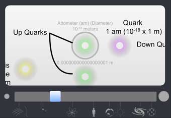
Here’s a great z-axis zoom-through of the universe [link via Kris Lachowski] showing the vast range of scales from the sub-atomic level to the outer reaches of the known universe.

When I was a kid, I read an illustrated book from 1957 called The Universe in 40 Jumps that pulled a similar trick in a succession of 10x steps; a predecessor to films like Powers of Ten (and partial inspiration for The Right Number).

Looking at this latest effort to make the incomprehensible comprehensible, all I can think is that the universe has gotten A LOT bigger, since I was a lot smaller.

Have a great weekend…

…you tiny, insignificant specks.


The Infographic that Ate Comics

Damian Niolet recently sent word of a giant infographic he created as a personal cheatsheet showing…

Um…

Well, here’s his (perhaps a bit tongue-in-cheek) description from the graphic itself:

“A graphical representation of the process of creating a work of fiction in comic book form and the tools and knowledge necessary to do so, as based on the theories and works of Scott McCloud (with some minor additional concepts from Damian Niolet).”

It’s big, beautiful, and kinda terrifying  (to me at least), and if you want to download a hi-res copy, you can find a link to do so either here or here.

I have a weird job!


Wanna be a Guinea Pig?

Neil Cohn is looking for volunteers to, well… look at comics. You guys can do that, right?

He’s even offering a drawing for a prize, so go for it.

And while you’re at it, check out Neil’s other studies and essays at his Visual Linguist blog.

[link via Journalista]


Information is Beautiful

Information is Beautiful has been around for a while, but it’s such a great site, I just wanted to give it a shout-out here.

In the last 100 years or so, many technology watchers (including Einstein, IIRC) have lamented how the human brain has barely changed while its many inventions continue to reshape our environment at a constantly accelerating pace.

Short of Eugenics 2.0 (probably NOT a good idea), we need to get smarter FAST, and recent advances in Visualizing Information are one of the fronts that look especially promising. To a cartoonist anyway.

Not all of the charts David McCandless offers up on his site are in the spirit of rigorous scholarship. Some are just rhetorical jabs. But see if you don’t feel your own brain crammed with ideas after a stroll through its pages.


Not Comics, but Cool…

A lot of you may have already seen this experimental Arcade Fire “video” by Chris Milk (it’s been out at least a month) but if not, definitely give it a spin. Don’t be shy about giving them your old address, it’s worth it.

Then check in with the latest Chrome Experiments and consider how some of these new tricks might be applied to comics, so I can retroactively claim this was about comics afterall.

[via Billy Poulos]


The Internet of Things?

Not comics-related, but I found this article about the impending availability of more wireless spectrum kind of interesting, and I liked the little “Internet of Things” video IBM put together (found via Mark Essel). For a corporate promo, it does a decent job of visualizing legitimately interesting issues, without just shilling for a specific product.*

Big companies seem to be doing a better job of earning those little logos in the last few seconds of their videos ( the herding cats video for example). More are earning at least an “aww” or a “hmm” from us. Fewer just an “oy.”

*though, as the article points out, it may be shilling for a less-than-desirable world, privacy-wise.