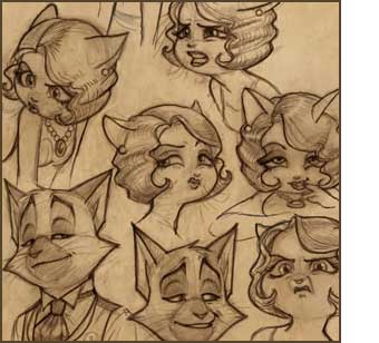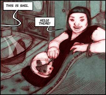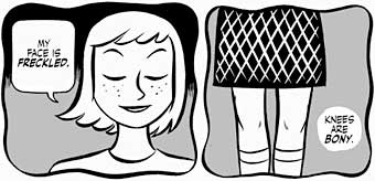
So, there’s this silly, adorable, sexy little comic (NSFW, but only barely so far) called Gingerbread Girl by Colleen Coover and Paul Tobin running on Top Shelf’s ts2.0 section.
Like, I assume, all of the comics on ts2.0, Gingerbread Girl can be read online, but they’d really like you to actually buy the book. Which is reasonable, of course. They are a publisher.
Thing is, I really like the web presentation when you first get there. It’s clean, nicely designed. Colleen’s black and white artwork looks great online and they’ve thoughtfully broken the pages into two tiers each so they’ll fit on most screens.
Best of all, when I’m done reading Page One, I can just click and Page Two instantly loads. And when I’m done reading Page Two, I can just click and Page Three instantly loads. And when I’m…
Oh.
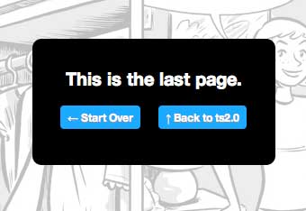 *sigh*
…which is not true, because there are five more parts online already that I can read.
At this point, if I want to keep reading, I can ignore the alert box, find the drop down menu at the top or bottom of the page (maybe with a bit of scrolling), see the options to remind myself which installment I’m on, based on which installment is missing from the context sensitive menu (sophisticated touch, that) and select the next installment.
And… back to reading!
Fortunately, I only have to do this every three pages so it’s not distracting. No, not at all.
Is this what we’ve come to? When even the best designers (again, I like the way ts2.0 is designed for the most part) have to degrade the reading experience online for fear of making the print version superfluous?
2011, People.
2011.






 *sigh*