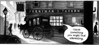
 Boy, first the Flatiron Building and now this?
Working with First Second and Mark Siegel is turning out to be a pretty cool gig.
 Boy, first the Flatiron Building and now this?
Working with First Second and Mark Siegel is turning out to be a pretty cool gig.
 Talked to a lot of people on my latest fact-finding mission to New York as I head into the rewrite phase of my graphic novel.
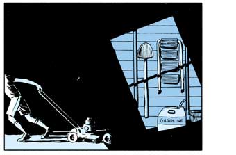
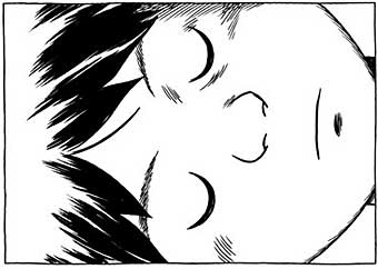
One of them, Nathan Schreiber, I had the pleasure of meeting last week, so this is as good an excuse as any to plug his great comic Power Out (image above) now running at Act-I-Vate.
Shouts out as well to Dean Haspiel, Seth Kushner, Christopher Irving, Matt Madden, Jessica Abel, Tom Hart, Leela Corman, Jason Little, Myla Goldberg, Martha Thomases, John Tebbel, Mike Cavallaro, Becky Cloonan, Keith Mayerson, Laura Lee Gulledge, Simon Fraser, Nick Bertozzi, Joe Infurnari, Leland Purvis, Christine Zehner, Editor Supreme Mark Siegel, and everyone at Deep6 and XOXO.
I don’t think I’ve learned that much in one week since I first discovered gravity as baby. Thanks, everyone!
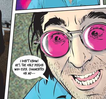 Dan Goldman has a new comic up at Tor.com which loads one panel at a time. Works pretty smoothly.
What’s interesting for me (apart from the art and story, of course) is how seamless it felt on a fast connection where the panels dropped in right away, and how jarring it was on a slower connection when the whole page vanished between loads. Speed definitely improved the reading experience.
Since the early ’90s, I’ve struggled to look past glitches that had more to do with temporary technological limitations to the various new format ideas artists have been trying out. I’ve tried to look ahead to a time when all those problems would be solved—like, say, 2010. Ah well. Patience, patience…
Dan has an interesting interview about the project with Seth Kushner at Graphic NYC where he talks about the story and the process, with a nod to Yves Bigerel’s Digital Comics which helped inspire the format.
[Edit: Last night uploaded an unfinished version of this post, since I forgot to save the final. Above is the final version.]
![]() Douglas Rushkoff is offering an online preview of a new comic called X (Heidi’s comments here). Looks like a fairly cool comic, with some pretty art by Cheoljoo Lee and Younger Yang. And as usual, the format got me thinking.
Douglas Rushkoff is offering an online preview of a new comic called X (Heidi’s comments here). Looks like a fairly cool comic, with some pretty art by Cheoljoo Lee and Younger Yang. And as usual, the format got me thinking.
The preview is your basic repurposed printed comic book on the screen (*sigh*), but looking at the tiny, unobtrusive controls on the lower right of my screen, I realized that one of its strengths (offsetting the annoyingly long load times) was the high ratio of screen real estate devoted to comics versus navigational elements.The controls and loading bars were as tiny and unobtrusive as possible, (and the preview doesn’t blur everything between spreads for no reason which is a plus).
So I thought, hey, there are really only three types of pixels you’re going to be looking at if you sit down to read a comic book or graphic novel on the screen. There’s (1) the comic, (2) the controls, and (3) the crap—”crap” being logos, chatter, ads, useless branding, etc.
I figure most readers would want the ratio from 1 to 2 to be as big as possible. On my admittedly big screen, the preview’s comics-to-controls ratio is a whopping 170 to 1. Not bad!
And where the crap is concerned, I’d think that most readers would want the crap to go away entirely when they settle down to read a long comic and sure enough that’s what the preview does.
As usual, this doesn’t really apply to strips which have always thrived in a sea of distractions; and I’d still favor arrow keys or the spacebar over hunting and pecking; but where the long form stuff is concerned—the online equivalents of comic books and graphic novels—I just thought it might be useful if we artists took a moment to consider our comics-to-controls ratio, as well as our comics-to-crap ratio.
Alex Fellows checks in to let us know that his new comic Spain and Morocco has begun its online serialization. If anyone wants to get in on the ground floor, now’s your chance.
Looks like a good start to me, and the cover is pretty cool too.
Kate Beaton sums up her experience at APE this year with a drawing of fifteen characters, cartoonists, and friends from the event plus URL’s. It’s a fantastic drawing that makes you want to see Ms. B draw everyone’s comic for a month (if you didn’t already), and a great way to commemorate the event.
I could see it being a little more than that though. I’m betting that in ten years or so, it’ll also serve as a snapshot of a moment in a comics community, frozen in time like that photo of the sailor kissing the nurse in Times Square.
People are always coming and going in comics. Communities are accidents that happen once in a while when a critical mass of like-minded artists stay in one physical or virtual place long enough to fall into each others’ orbits. They’re never permanent, but you can tell when they start generating the kinds of shared memories that will eventually earn that time and place a name—at least for those who were part of it.
This one doesn’t have a name yet, but it has a snapshot. Let’s just print it, put it in a envelope, mark it “Open in 2019” and see how things shake out.
 Yesterday’s topic, cross-posted over at my Facebook page, prompted reader Håkan Storsaeter to remind us that Crumb isn’t the only one to take on Genesis in comics form in recent years.
The Rev. Brendan Powell Smith, since 2001, has been chronicling the entire Old and New Testament using Lego blocks at The Brick Testament. Check it out for some funny and genuinely creative visualizations of countless Bible stories.
And if you know of other attempts to comics-cize the Bible that we can read online, let us know.
 Jeph Jacques is offering some thoughts on how webcomics have changed in the last 6 years in his State of the Webcomics Union.
One particularly astute point:
“The idea of critical analysis of webcomics has largely died out. Sure, people still blog about webcomics and “review” them and stuff, but it’s become a tiny, tiny niche sector. I think this is mainly because there’s not a whole lot of point to reviewing something anybody can go look at for free and make up their own mind about! Is this a good thing? I have no idea.”
It’s a good read overall. Check in to read the post and the many comments.
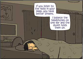 Must be new webcomics week. Check out Mr. Allison’s latest here.
Strangely, it also begins with the protagonist in bed (see yesterday’s post below). Hmm…
 Tom spotted it first: A new webcomic by Derek Kirk Kim with a new panel added every day. Looks cool so far. Check it out.