On the Drawing Board:
The Visual Communication Project
For a while now, I’ve been working on my not-so-secret project: a big nonfiction comic about visual communication across disciplines.
This blog will continue to be pretty quiet while I toil away at the book, but bits and pieces have been showing up in my visual lecture as well. If you manage to catch me on the road anytime in the next year or two, you’re bound to see evidence of this particular obsession.
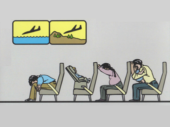
Visual communication and education have been a long-standing fascination of mine. Nonfiction comics artists, data journalists, educational animators, visual facilitators, signage & wayfinding experts, visual presenters, even those who study facial expressions and body language; they’re all engaged in the struggle to better understand how we learn through seeing. But they’re too often knocking on the same door; trying to reinvent the wheel; unknowingly stumbling upon the same principles as their distant colleagues.
I’m hoping that I can articulate some of those common principles and help stitch together those disparate fields in a useful way. I don’t have a title yet, but I often describe it as “an Elements of Style for visual communication.” [Update: possibly a mistake, according to Neil Cohn who directed my attention to this.]
I’m hoping it won’t run quite as long as the last book. Right now, I’m doing research enough for a very long book, but I’m hoping to apply it toward writing a short one. We’ll see!
Anyway, don’t expect a lot of blog updates for a while. Follow me on Twitter for more frequent chatter on various topics (including politics—sorry!), but when the book is finally ready, I’ll certainly post about it in both places.


ALWAYS glad to see a blog post update. Maybe it’s just because I still keep one. Also hope, somehow, that you might meander towards the midwest at some point. Otherwise, I’ll just have to come visit my sister again. :”D Best to you and Ivy!
-mike, formerly
Visit anytime! And keep blogging, ’cause somebody’s gotta.
[…] two-fer from the Theorist Emeritus Of Comics, Scott McCloud: Firstly, a general announcement of his next book, which we won’t see for a couple of years. He told me about this one in the wake of The […]
Very much looking forward to it. First volume in 2019?
I’ve learned not to make predictions. 😉
Politics eh? To bad you don’t have time to do a sequel of Bucket Full O’ Kittens. I wonder what this administration’s bucket would be full of…
Bucket Full O’ Scorpions, I’m afraid… 🙁
Wow. Coincidentally, I’ve recently gotten into theory about visual communication and have been trying to find stuff to read. I really look forward to hearing what you come up with.
Hi Nick –
On recommendation from our friends at the Exploratorium, I recently enjoyed an older book by R. L. Gregory, Eye and Brain. Good stuff. Arnheim holds up pretty well too.
Much is just a matter of keeping up with recent developments, of course. A fast-moving field!
[…] […]
You must be getting comments like this all the time, but as someone who was deeply inspired by your books while writing his PhD and as someone whose students come back to him regularly saying “Thank you! Thank you!” for sending them to read “Understanding Comics” as part of their mid-term assignment, I can only respond to the news about you doing a book on visual communications with one word:
Wow.
(and also feel depressed about having to wait for it…)
Do you have plans of going back to do prose comics after you’re done with this project? Because I thought “The Sculptor” was amazing (my review is linked).
Thanks, Raz!
Bound to do more fiction eventually. Just wish I wasn’t so slow!
I think I have a good title for the book; How about ‘Speaking Pictures’
?
Variations of that have been considered. Fortunately I have a LOT of time to mull it over. This book is going to take a while!
Fascinating! This is right up my alley and you are just the guy to give the subject a proper treatment. I’m all ears 🙂
When teaching comics-making workshops, I often start with a discussion on the design of the School Zone traffic sign. We talk about what it is supposed to communicate and why the designers didn’t just use a photograph of people crossing the street (or at least designs that include noses or hair). It’s been a fun way to introduce the idea of function, simplicity, and communication.
Looking forward to anything and everything you have to share 🙂